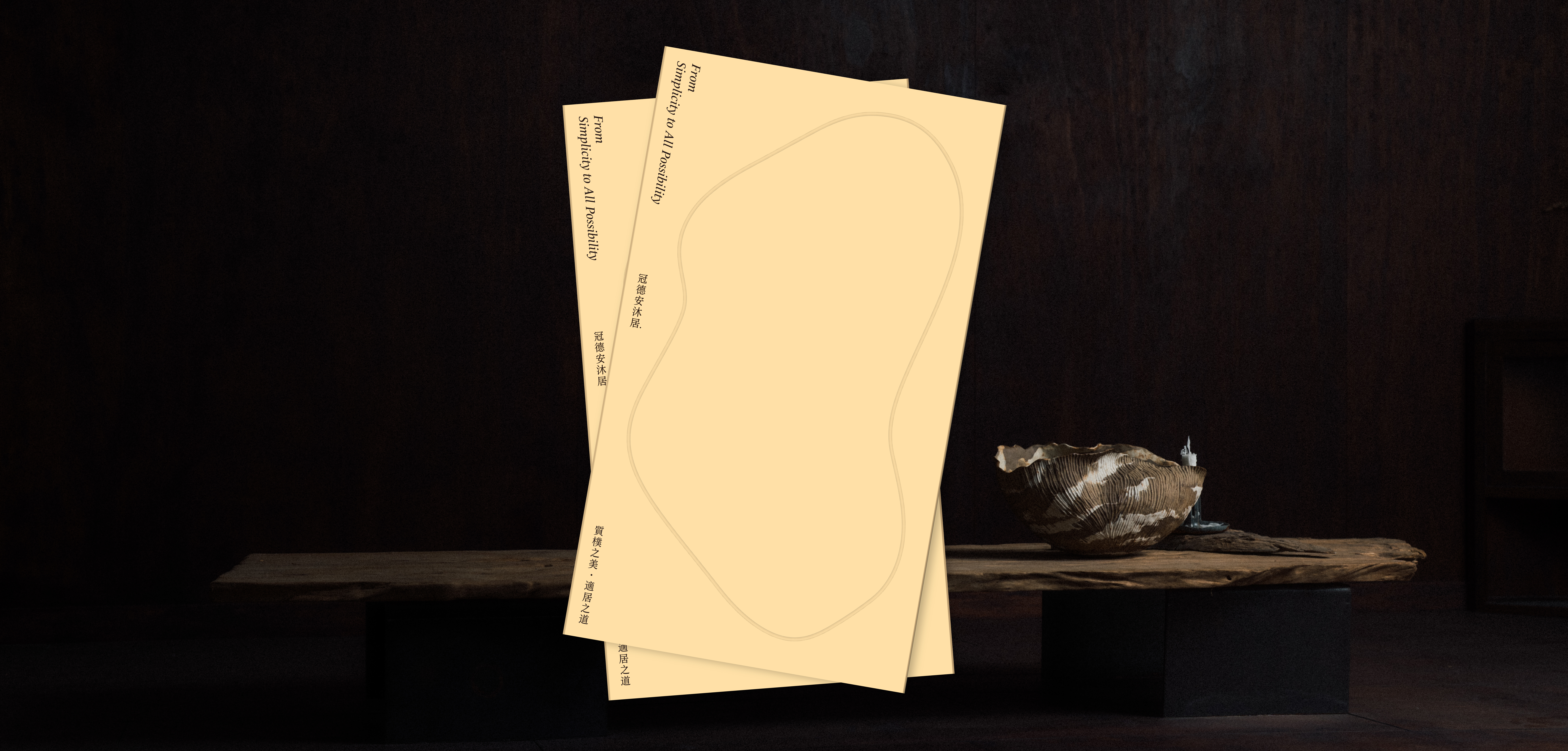
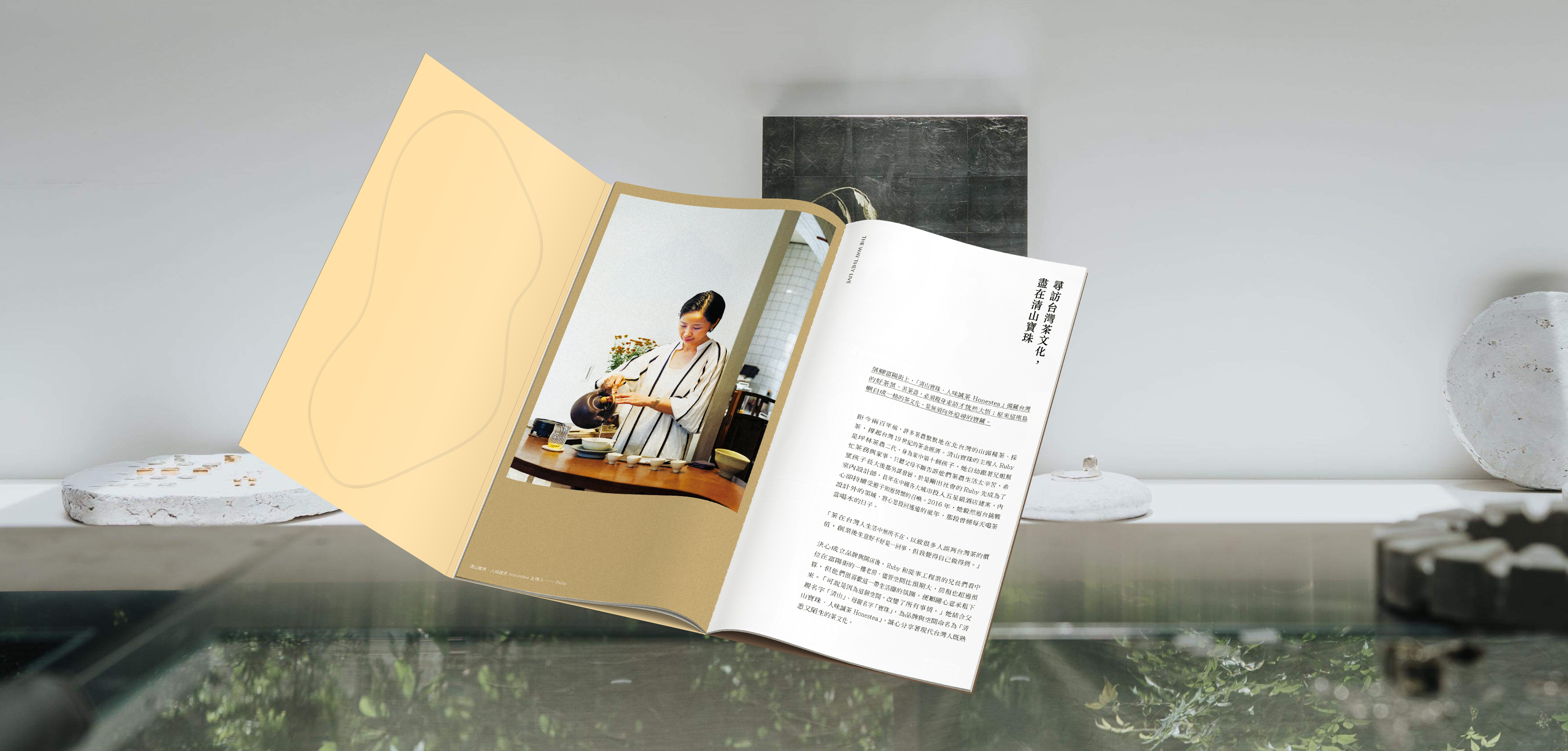
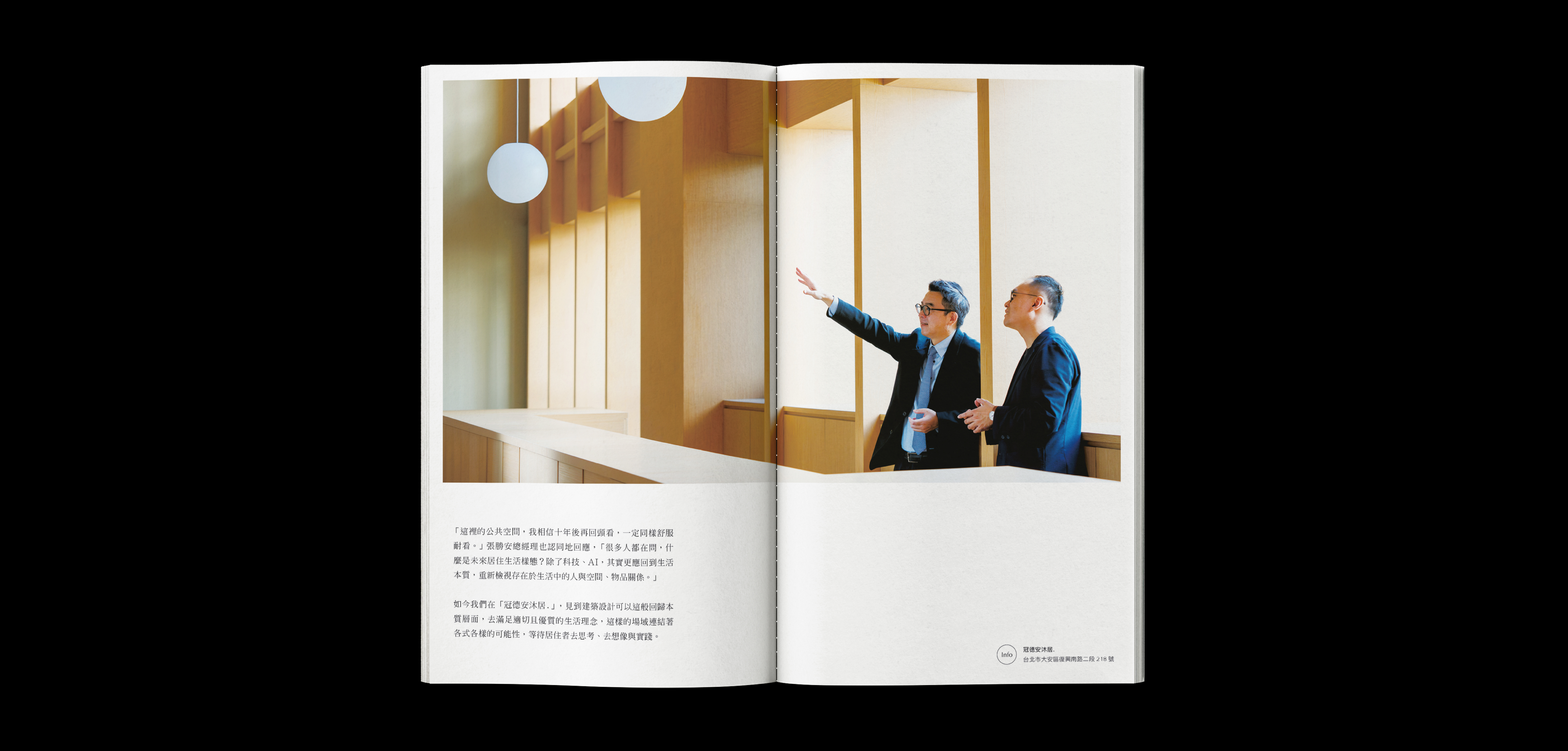
From Simplicity to All Possibility (2023)
Kindom Construction cooperates with MUJI RENOVATION to jointly create Japanese aesthetic style public facilities and living experience. MUJI RENOVATION believes that life is the leading role of housing, and continues to propose a lifestyle suitable for Taiwan through residential design and discussion. This time when thinking about the public facilities in this case, in addition to retaining the outline of the original space, we also hope to meet the reasonable and comfortable "good quality and good" life concept through the selection of materials, furniture selection, and minimal soft furnishings. Kindom Construction hopes to explore "livable life" through this case and present an aesthetic style based on essential thinking.
VERSE combines creative views and visual aesthetics from a cultural perspective to compile an image booklet for Anmuju. Continuing the discussion of this case, linking the aesthetic tonality of Kindom Construction, Daan Life Circle, and MUJI RENOVATION, the image booklet starts with the main axis of "the way of simple beauty and livability", invites people from various fields to interpret the beauty of simple style, and further explores The Daan area has the same tonality, stores or studios inspired by the essence of life, together with in-depth interviews with the person in charge of the project and MUJI RENOVATION, lead readers to experience the core spirit of the project.
Client. Kindom Construction Corp. / Producer. VERSE / Editor. Annie / Photographer. Shouya / Illustrator. Haper Ouk / Designer. Chiayu Lee
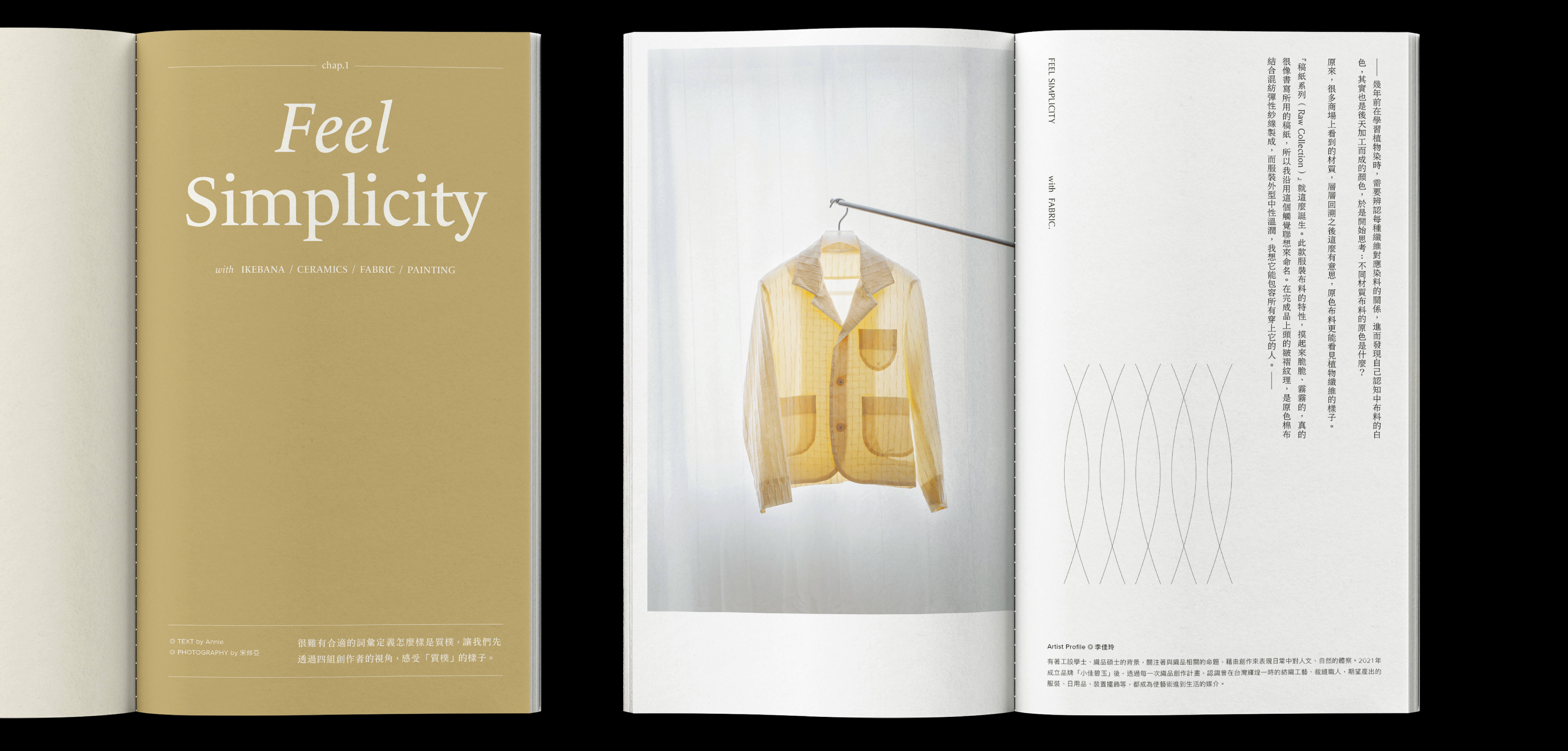
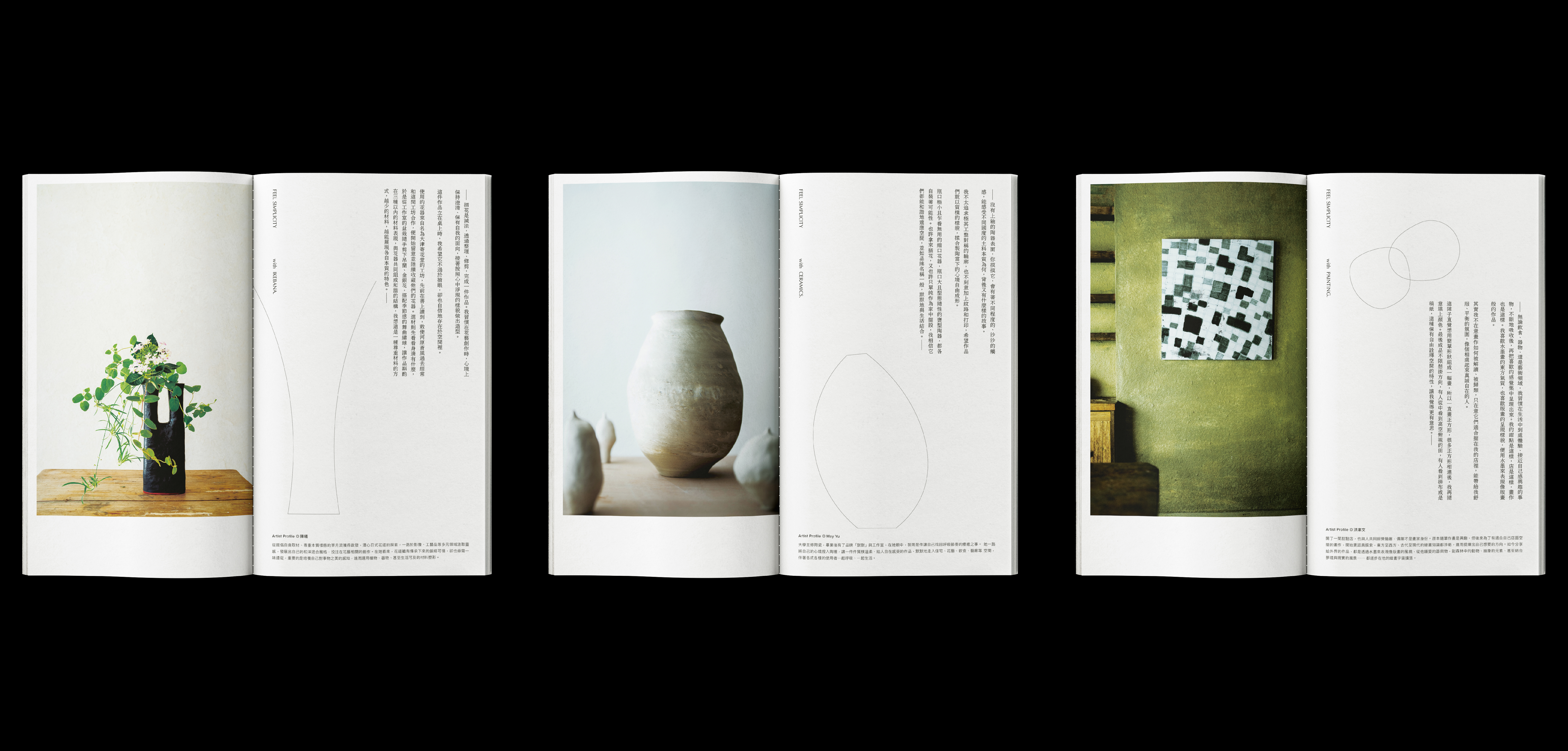
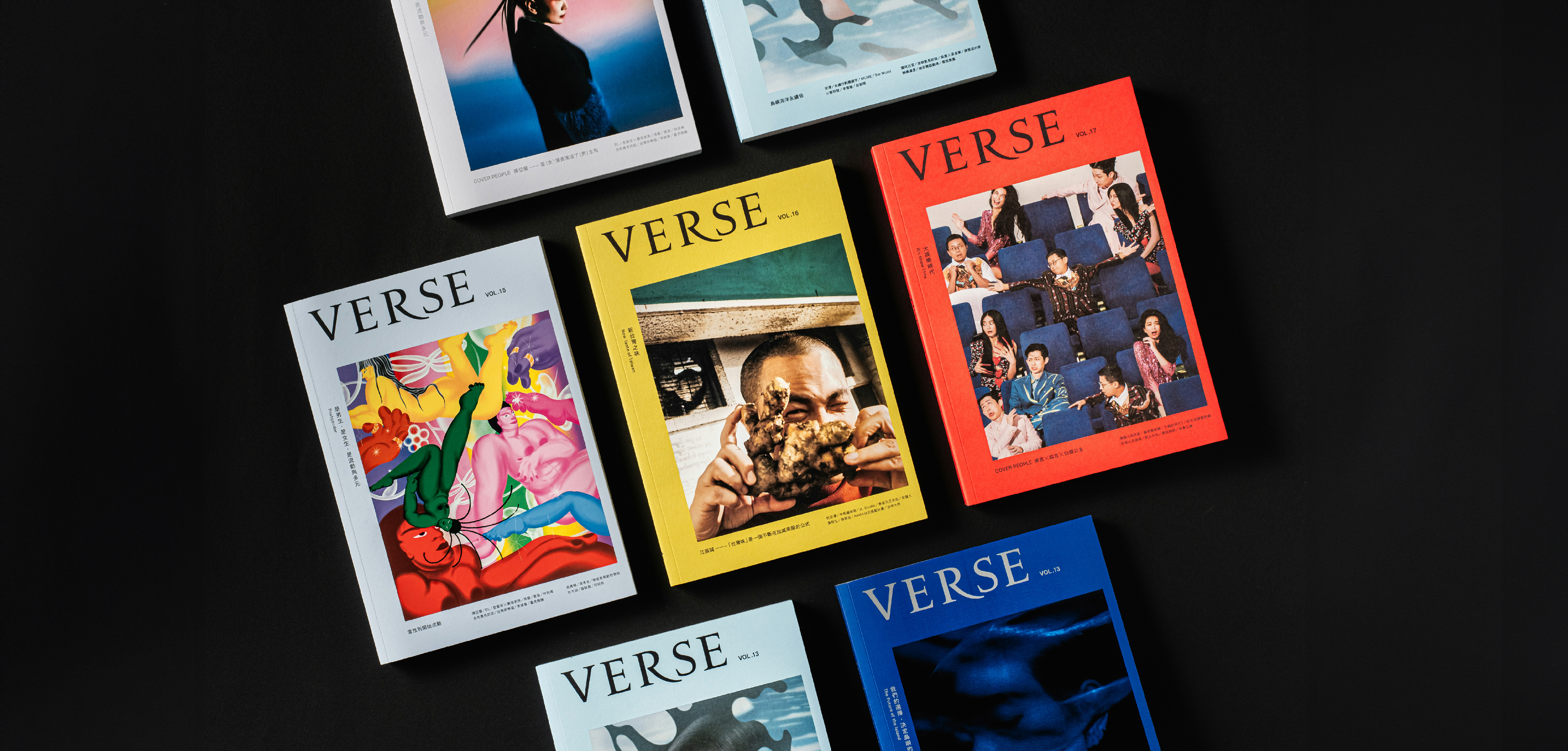
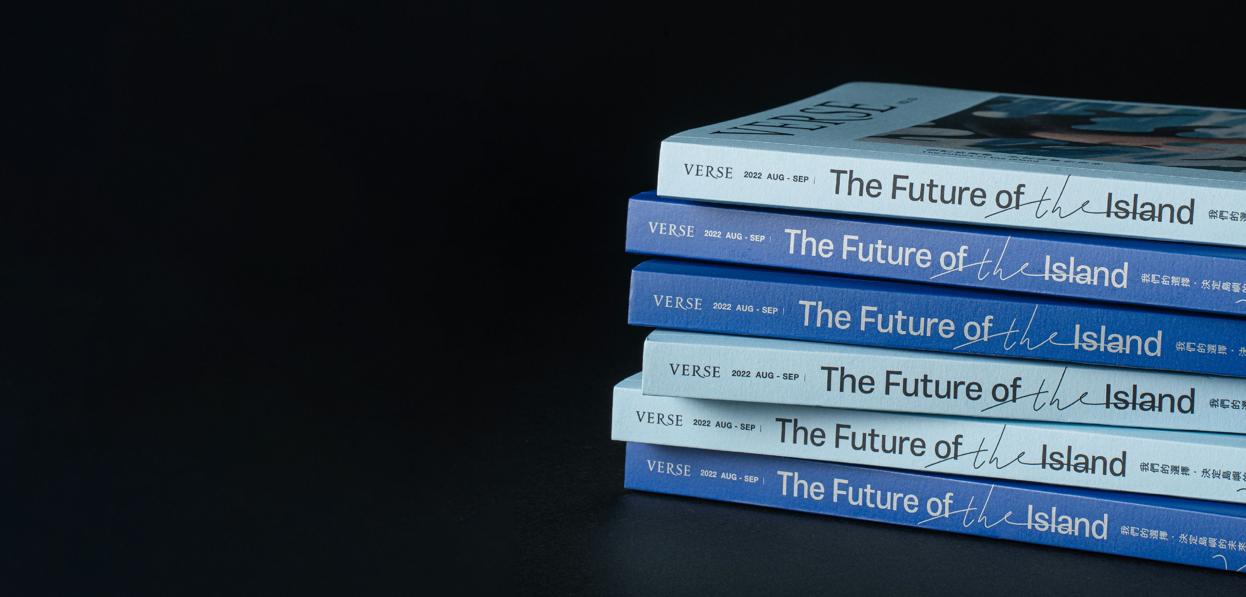
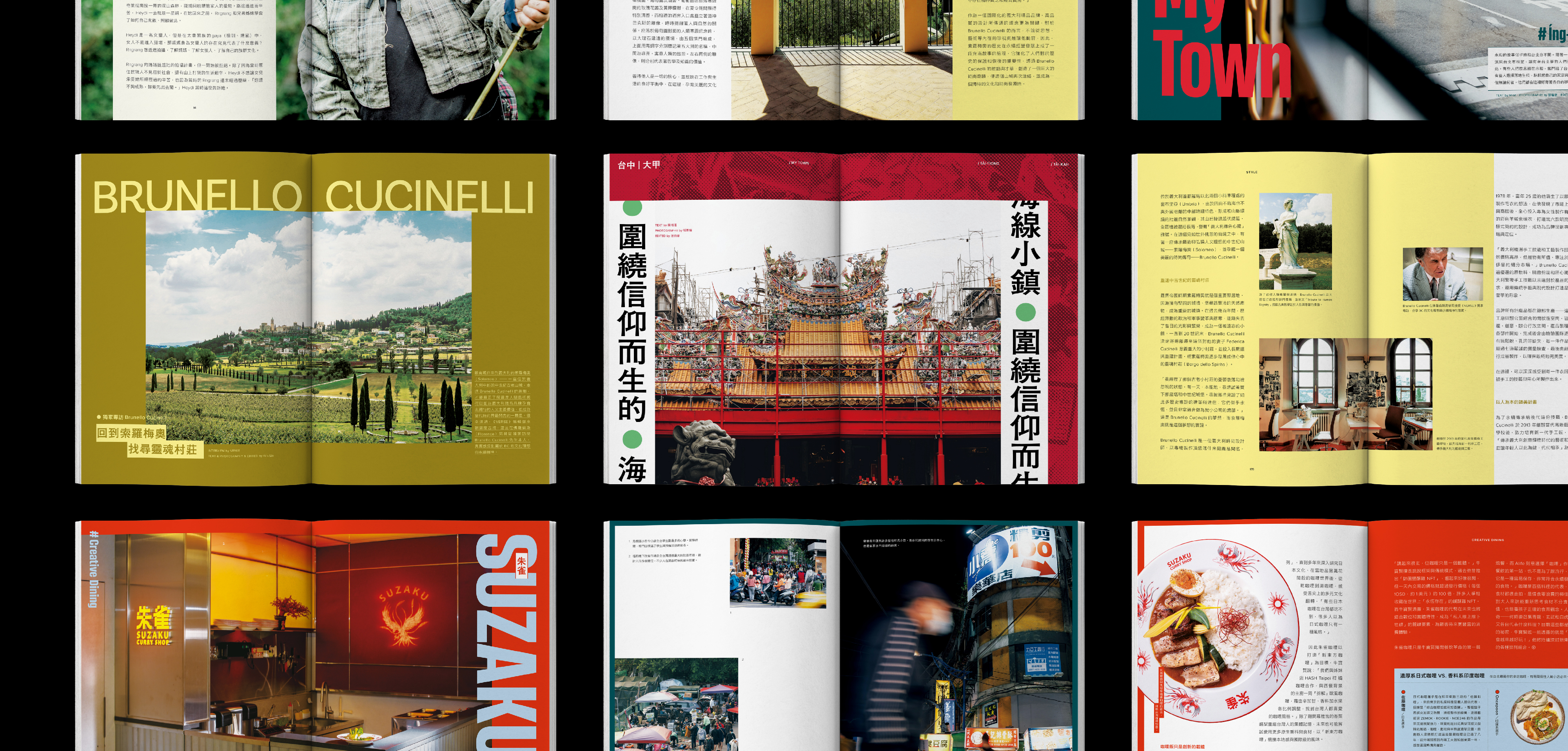
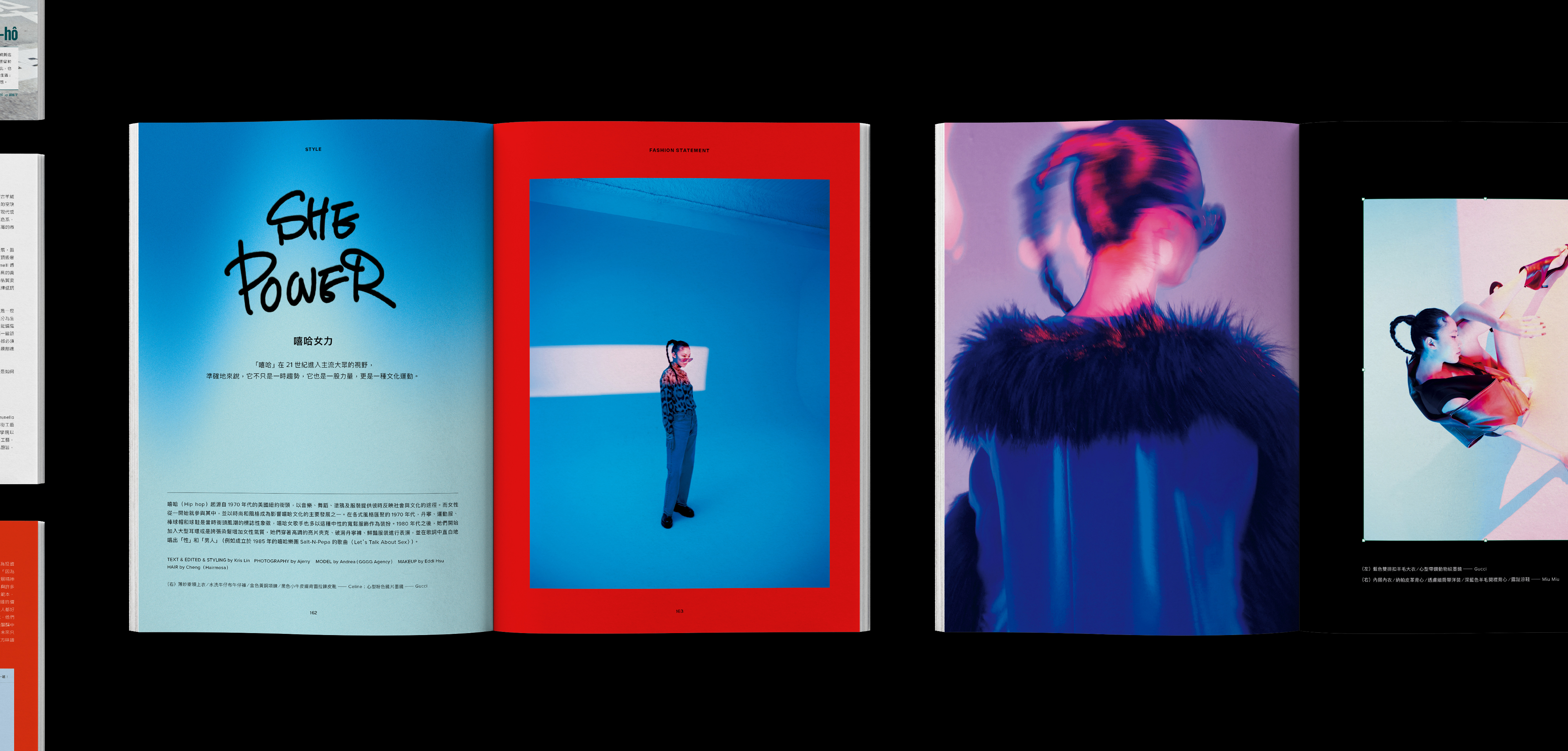
VERSE Magazine vol.13-19 (2022-2023)
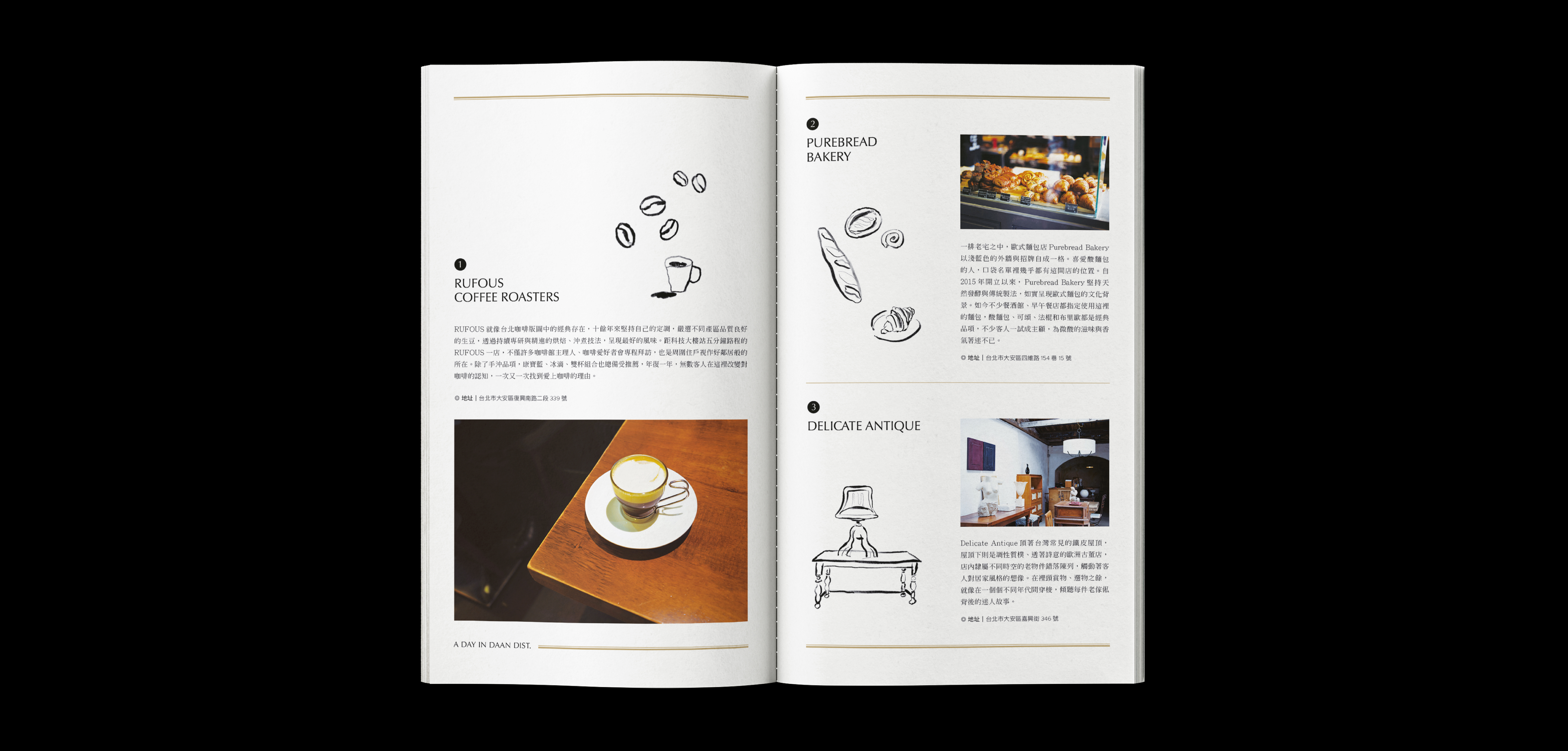
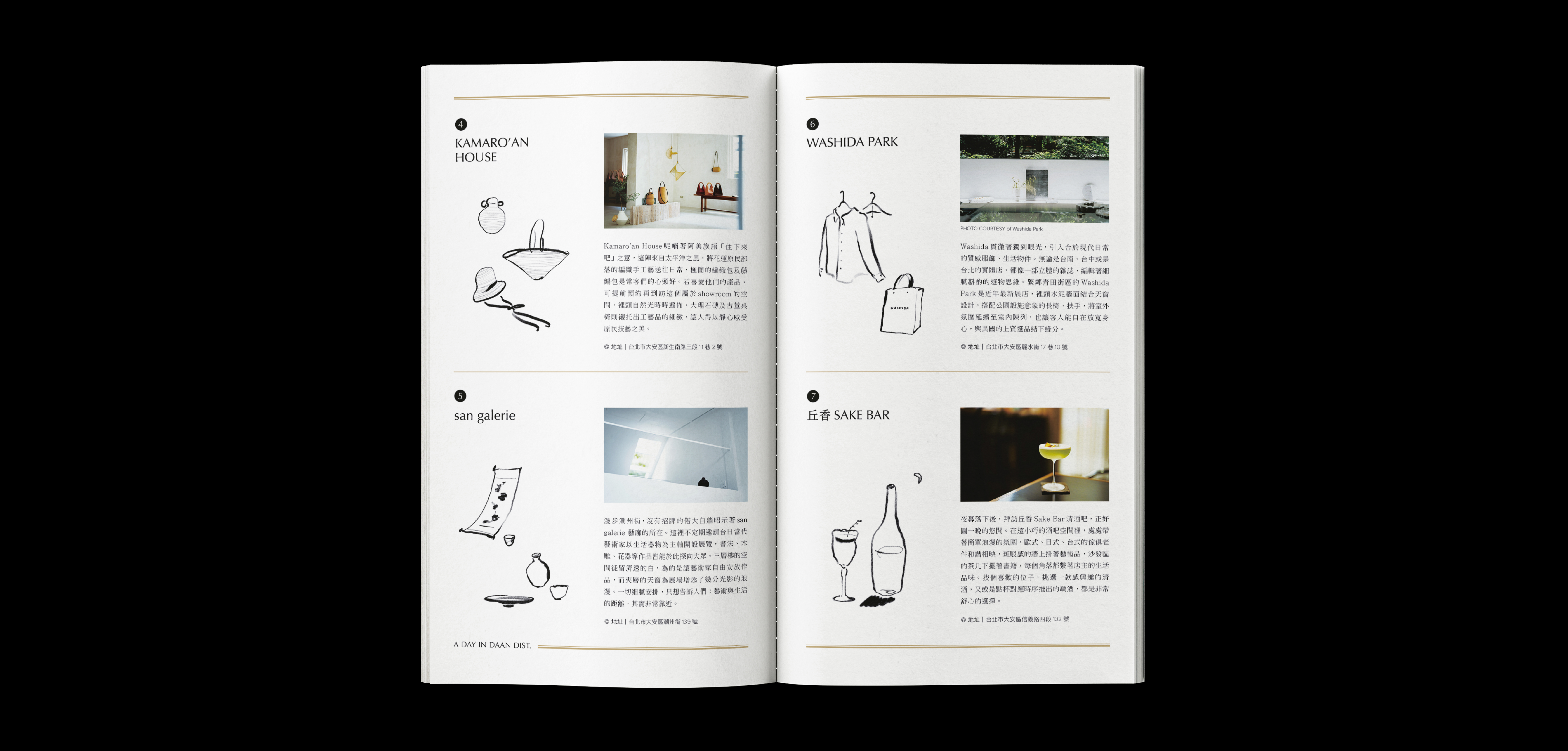
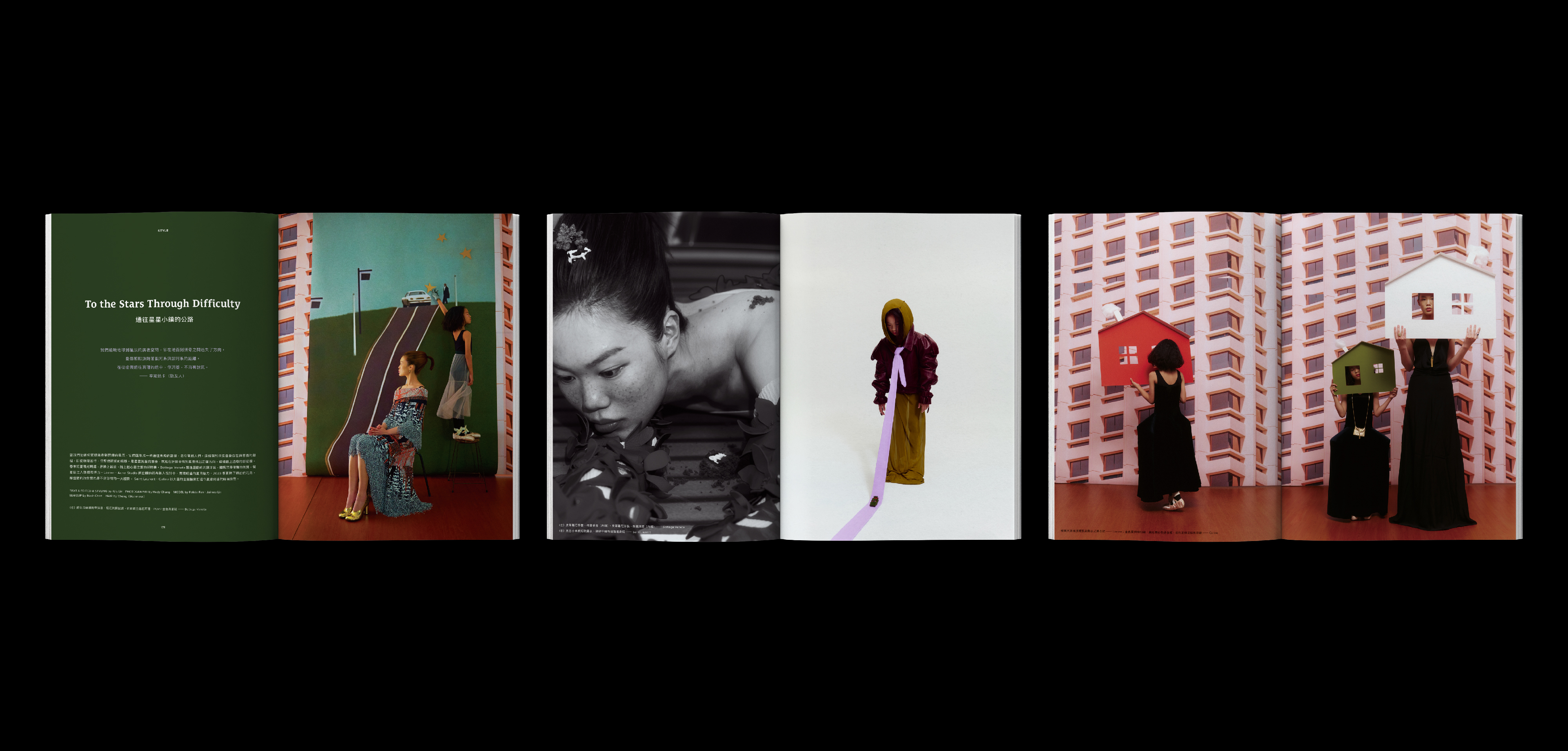
VERSE focuses on new cultural creativity, new business models, new value beliefs and new lifestyles. Culture is not just literary and artistic creation, but our way of life and the values we believe in. But culture is also creativity and aesthetics, the spirit and appearance of an era.
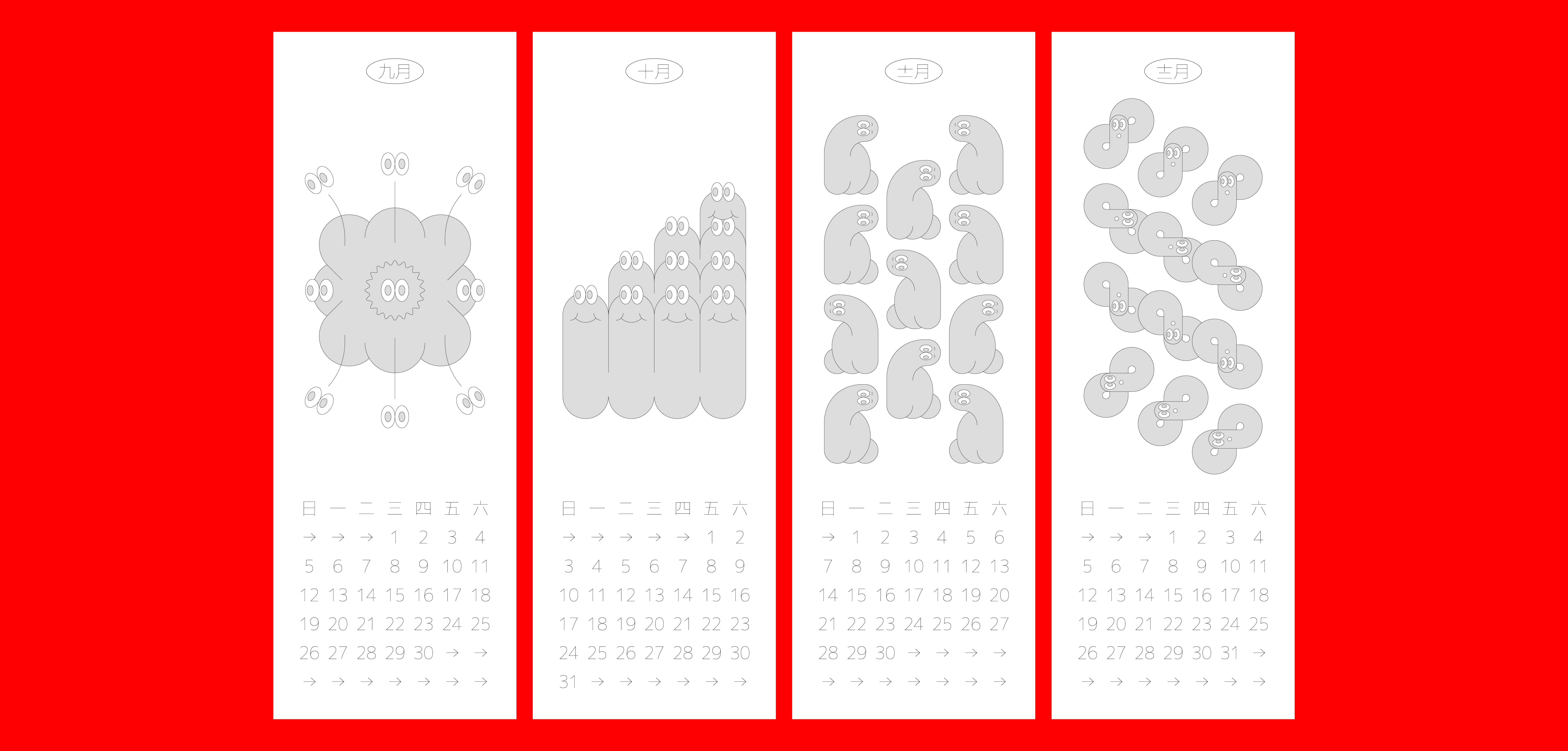
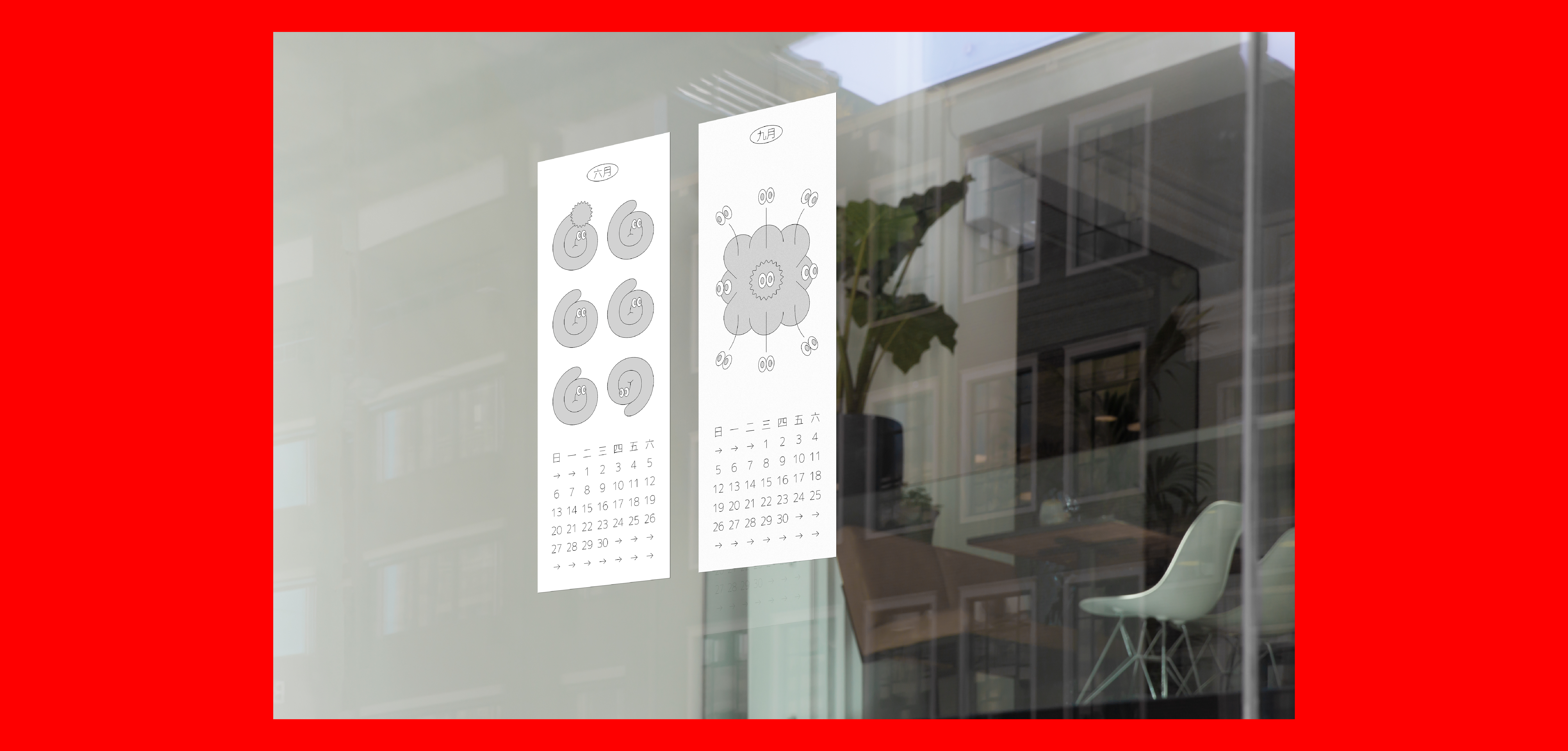
VERSE magazine's bold design aesthetic fits the theme of each issue. The relationship between text and images highlights the different tones of each unit and establishes a distinct brand style.
Publisher. VERSE / Editor. VERSE / Art Director. Jun / Designer. Jiafang Sie, Kin Lee, Zyinn Lin, Chiayu Lee
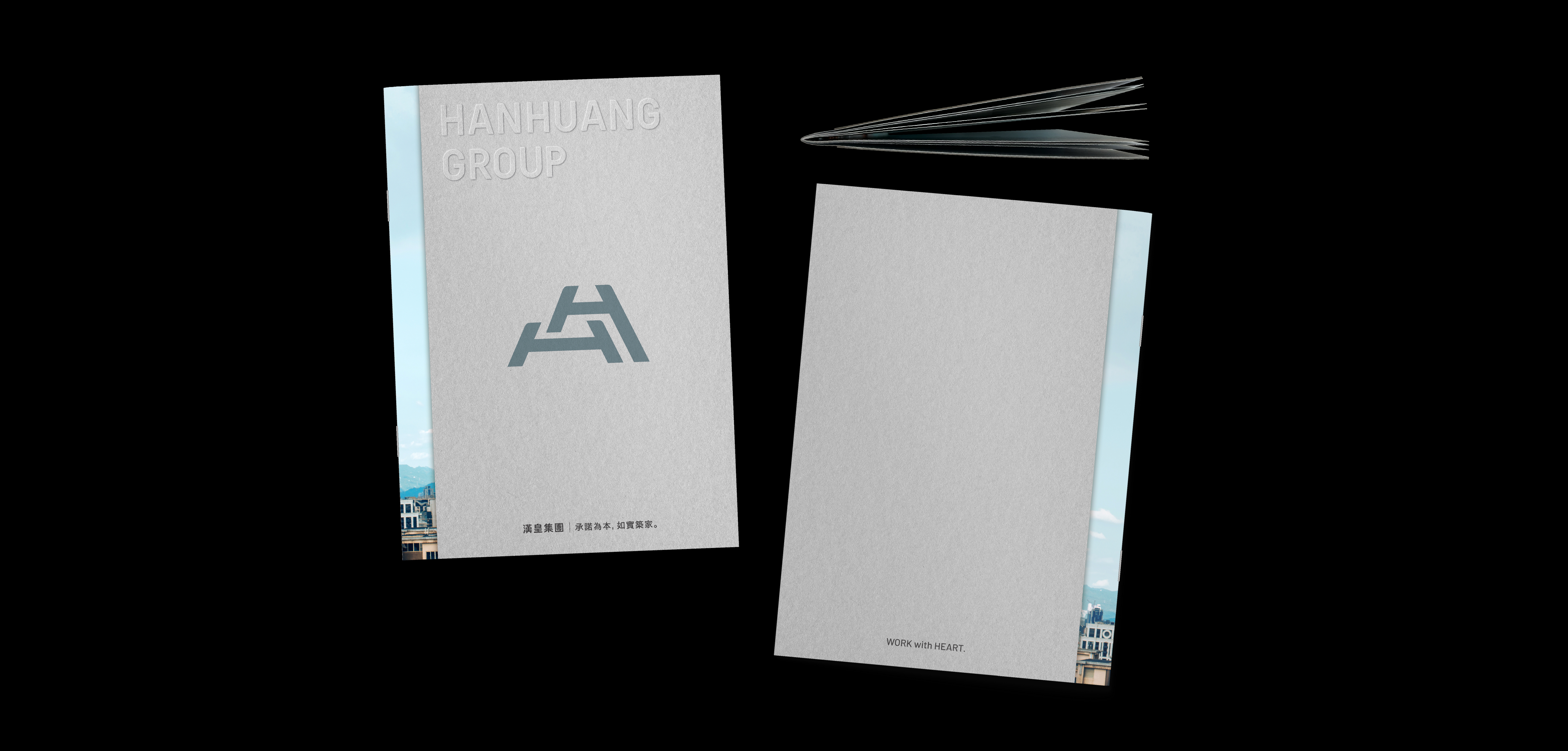
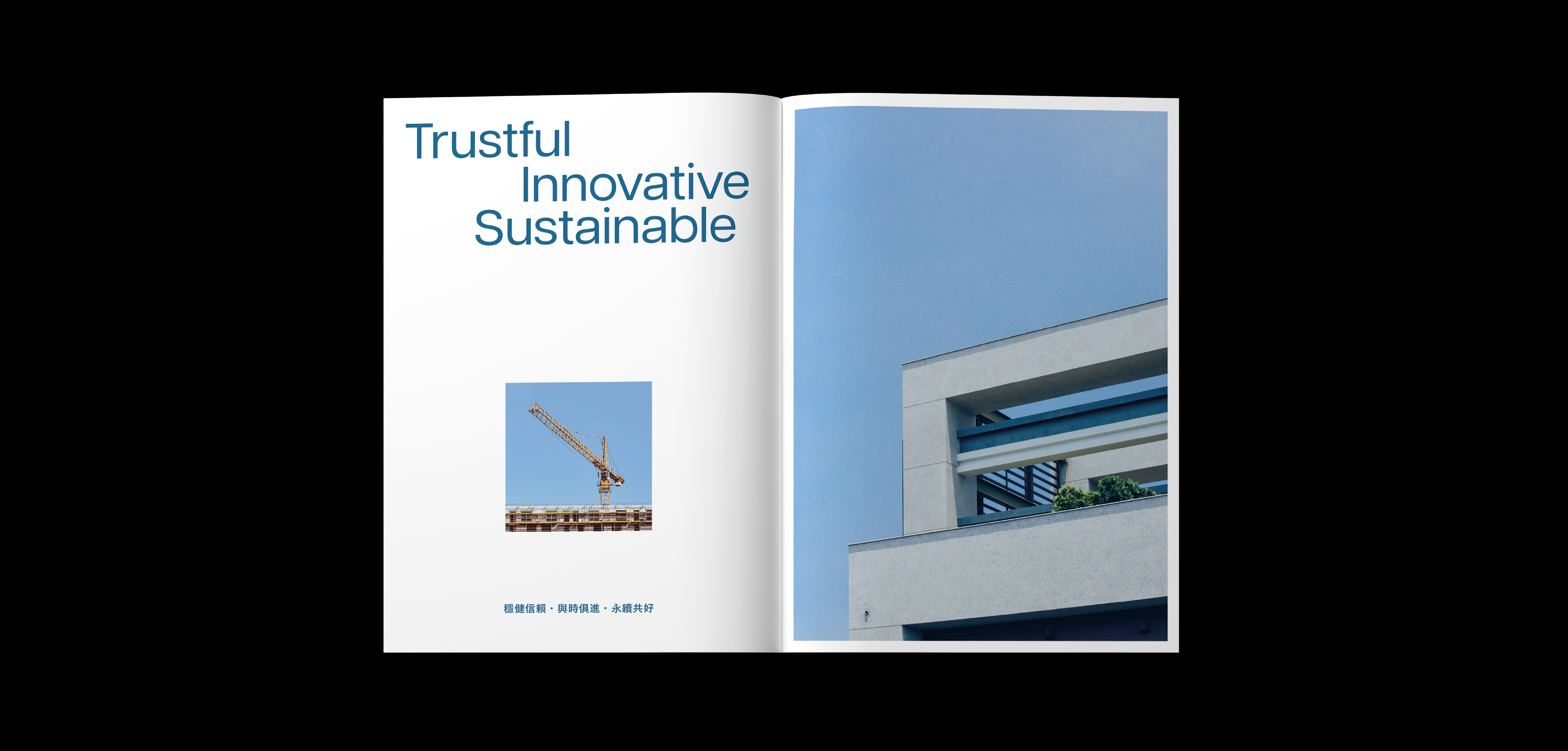
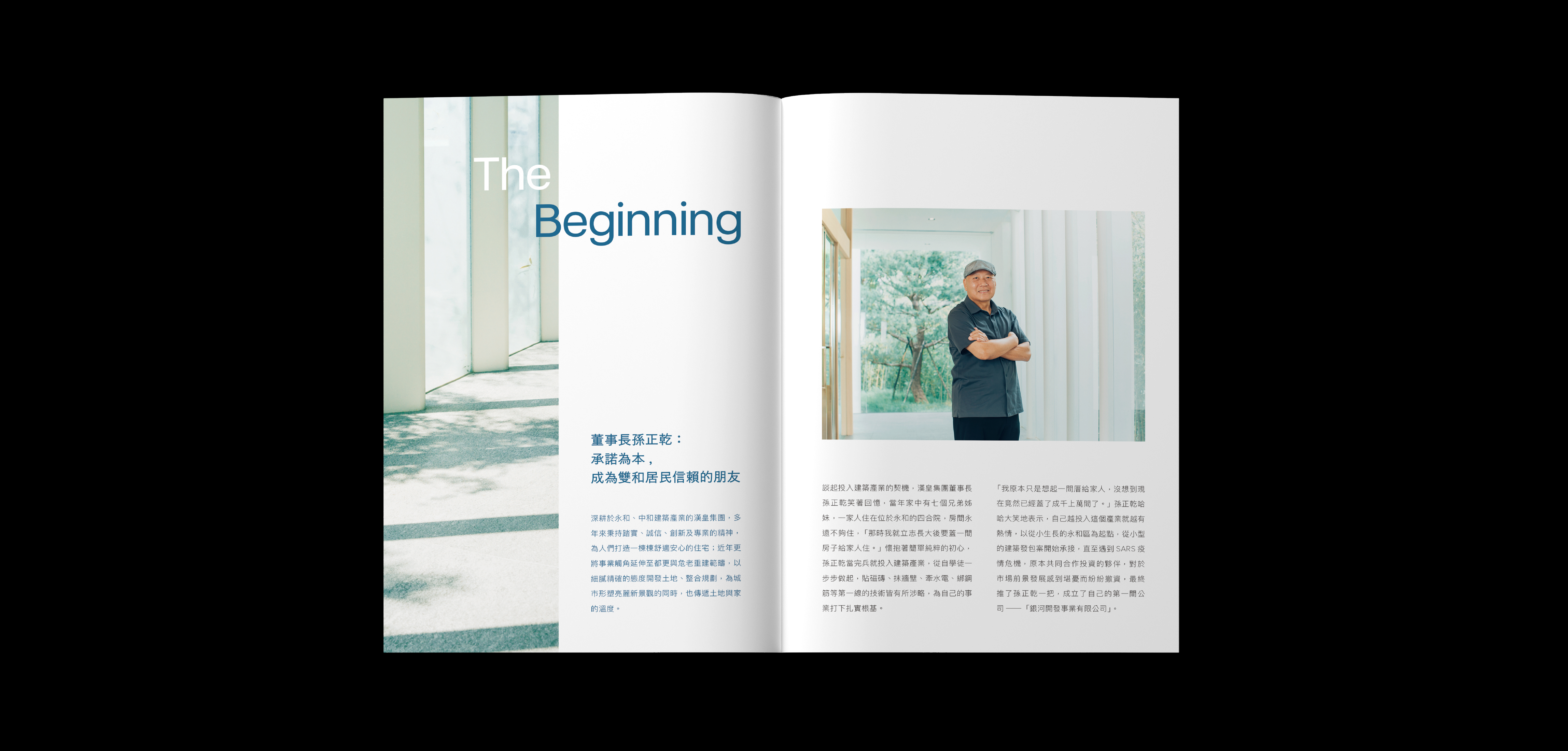
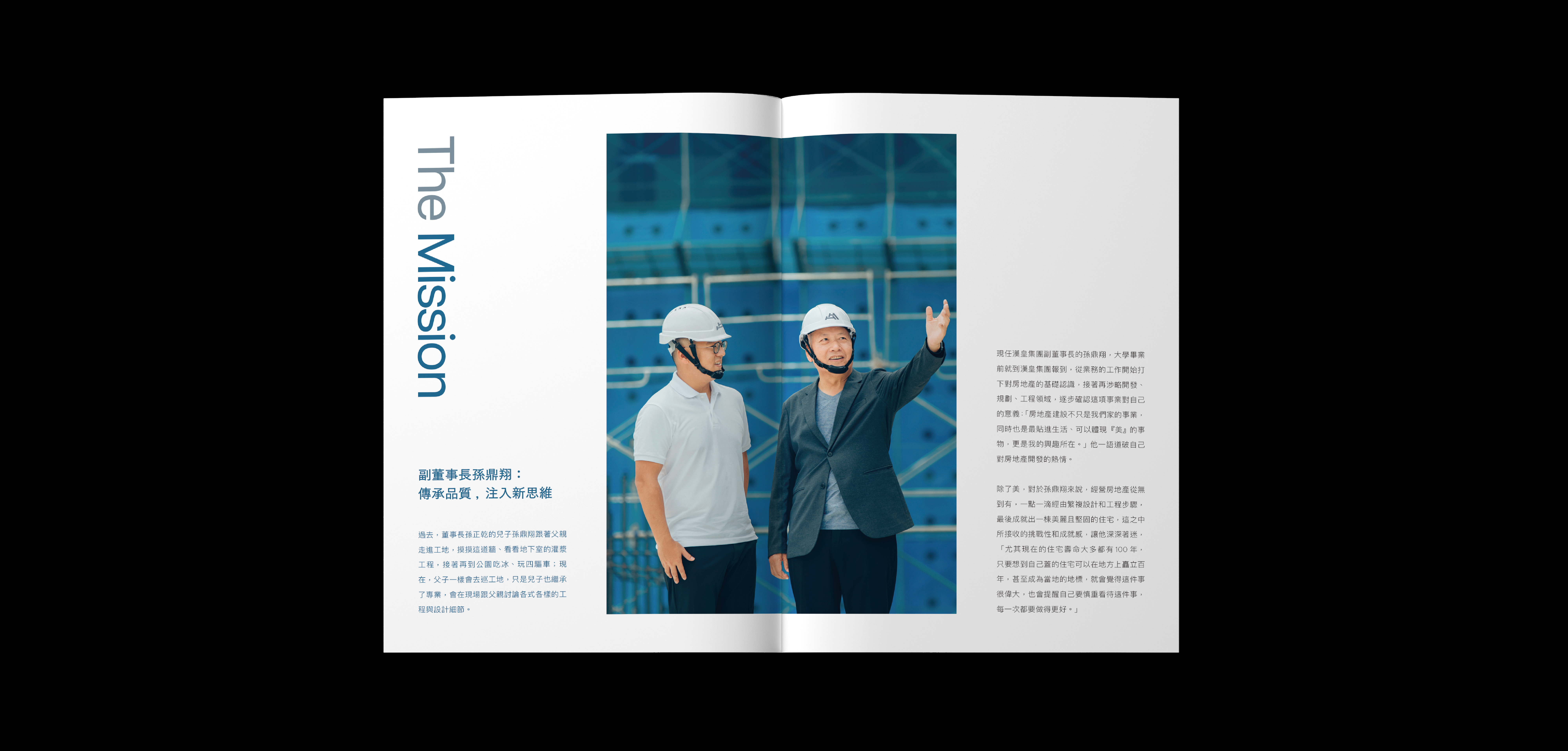
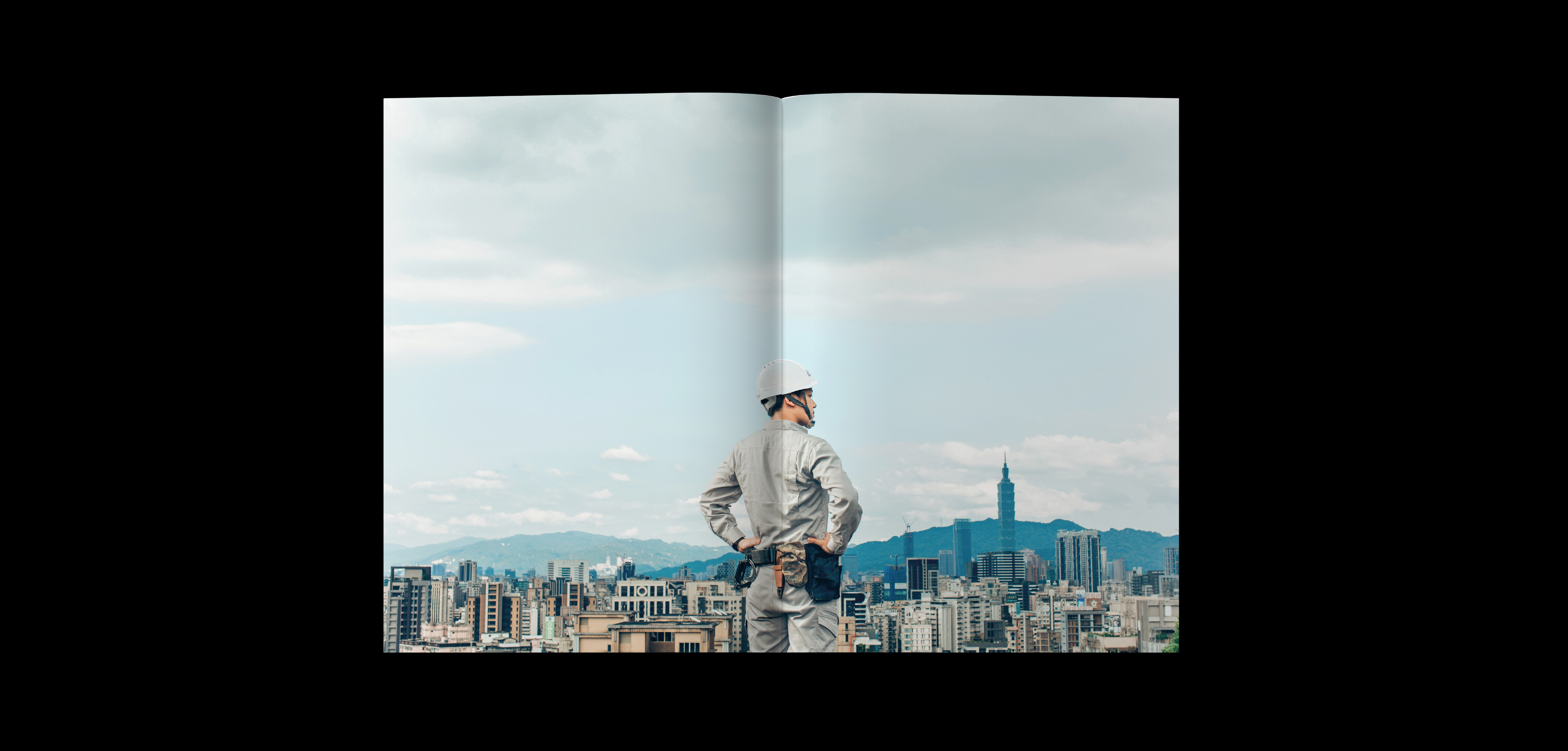
HANHUANG Group Book (2023)
Synonymous with safe architecture and a promoter of livable cities.
Hanhuang Group has been deeply involved in Zhonghe and Yonghe areas for many years, and has built safe buildings based on integrity and conscience. In recent years, it has actively cooperated with the government to promote urban renewal and reconstruction of endangered elderly people in the core areas of Greater Taipei Metropolis. It is the largest urban renewal builder brand in Greater Taipei. Looking to the future, we will create a better tomorrow with environmentally friendly and up-to-date construction methods.
VERSE uses in-depth reporting combined with unique visual aesthetics to convey the stories of companies and brands. We hope to reorganize the brand's positioning, operator and team concepts, service direction and value proposition of continuous development, and present them through a warm and humanistic perspective.
The design incorporates the redefined brand VI direction: sensibility, warmth, professionalism, and attentiveness. The cover uses a low-key and thick gray card, and uses embossing techniques to echo the purpose of "paying more attention to where you can't see it", presenting a delicate but subtle look. persist in.
Client. HANHUANG Group / Producer. VERSE / Editor. Annie / Designer. Chiayu Lee
![]()
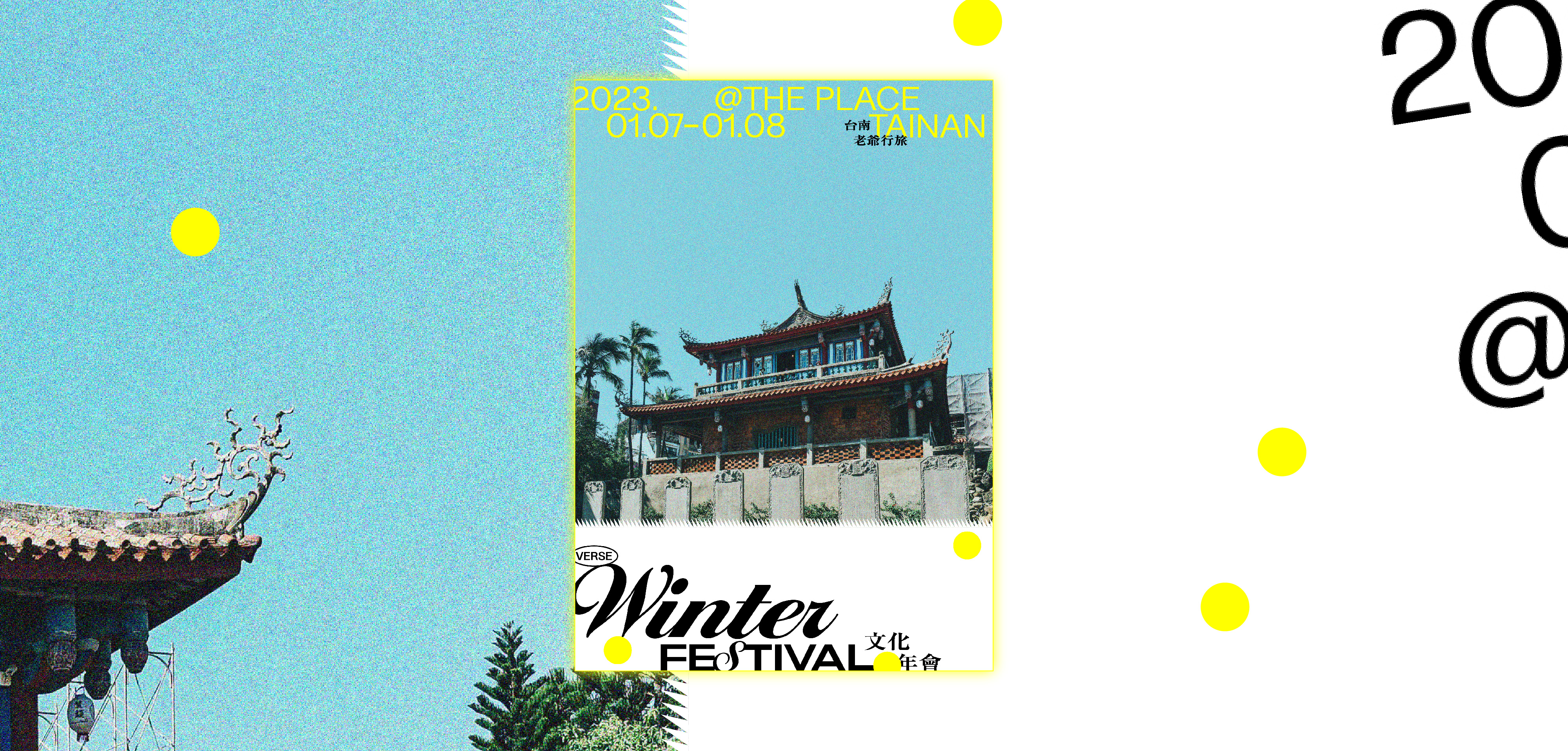
VERSE Winter Festival UNUSED Proposal (2023)
VERSE has gathered Taiwan's most charming and insightful cultural creators and concept innovators this winter. Taking the warm southern ancient city as the venue, we will explore the unique charm of Tainan's interweaving of old and new culture, and taste Tainan in this nostalgic and tolerant city of innovation. People who are stubborn and picky about food will have a winter cultural holiday for adults.
Producer. VERSE / Project Manager. Ruby Lin / Photographer. PJ Wang / Designer. Chiayu Lee
Changhua for the Future (2022)
In order to improve the quantity and quality of youth affairs development and business promotion, the Changhua County Government established a Youth Development Office in 2022. It is also the first county or city outside the six cities to establish a Youth Development Office. Through a series of meaningful policy measures, we will attract young people to stay, return and move to their hometowns, gather more young friends’ entrepreneurial dreams and motivation, and lead Changhua into the prelude to a new era.
The wave of young girls returning home in Changhua is fermenting and expanding. Young people returning home to start their own businesses are no longer working alone. Instead, they are exerting the power of the group in an organized and systematic way, connecting points and lines. The county government will always play a role. The backing of youth.
This special issue of "Changhua for the Future" is a very penetrating publication that closely connects characters who originally seemed to have three different aspects, from the second-generation successors of the industry who are deepening re-engineering, to moving the mirror to making choices. The young people who stayed in Changhua to start their own businesses finally turned their attention to the well-known brands extending outward. What these characters have in common is that they all have a passion to love their hometown and keep moving forward professionally.
Client. Changhua Youth / Producer. VERSE / Project Manager. Ruby Lin / Editor. Chen Xiang Jin, Guo Zhen Yu / Photographer. Wang Cheng Sean, KRIS KANG, PJ Wang / Cover Designer. Kin Lee / Inner Pages Designer. Chiayu Lee
, Chen Yu Cian
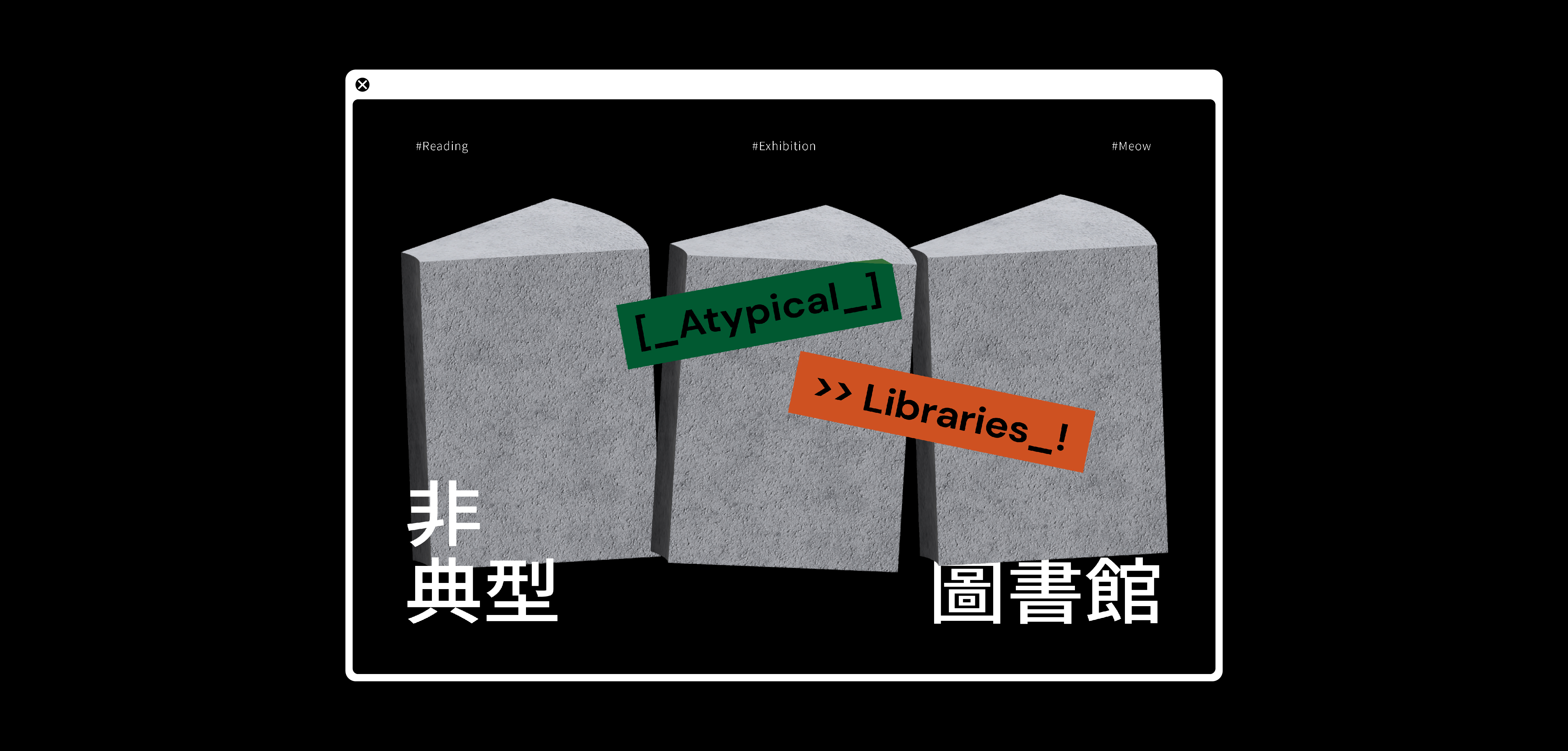
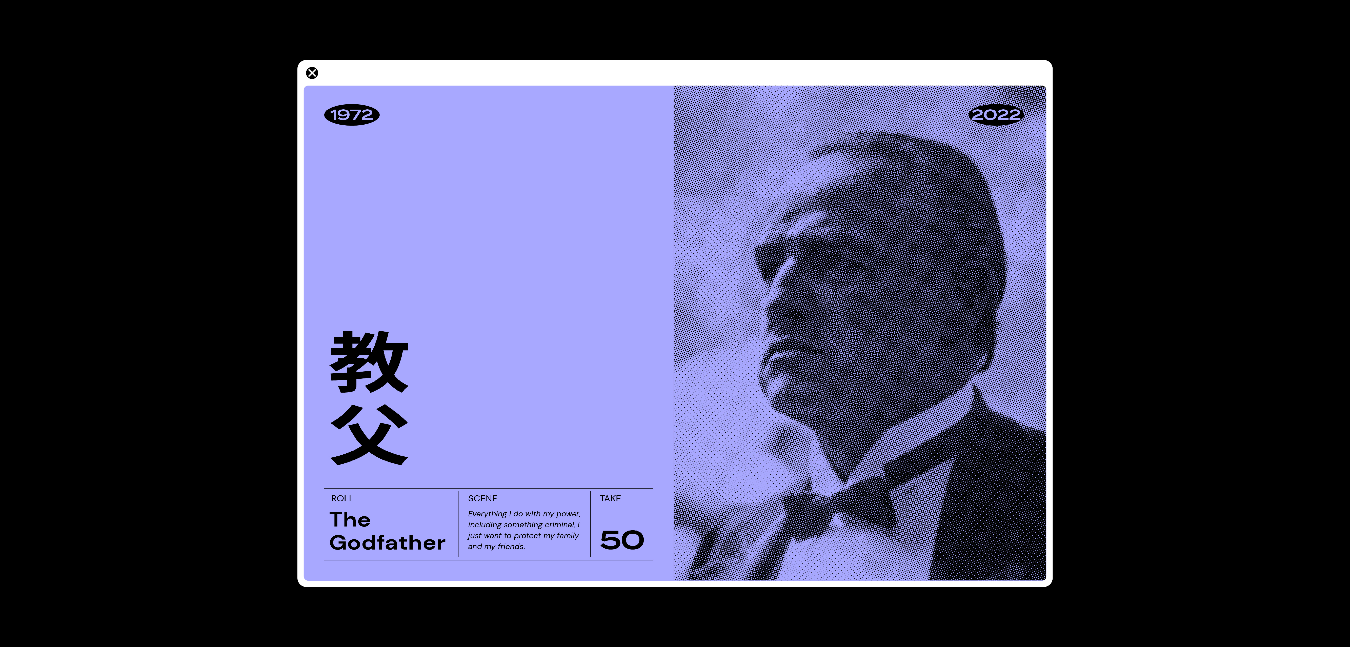
VERSE website banner collection (2022)
2022 Taiwan International Documentary Festival / Infong : Exploring coming of new music / The Godfather's 50th anniversary / Lu Mengxun : What’s next in CURATING? / Atypical Libraries (More information on https://www.verse.com.tw/)
Designer. Chiayu Lee
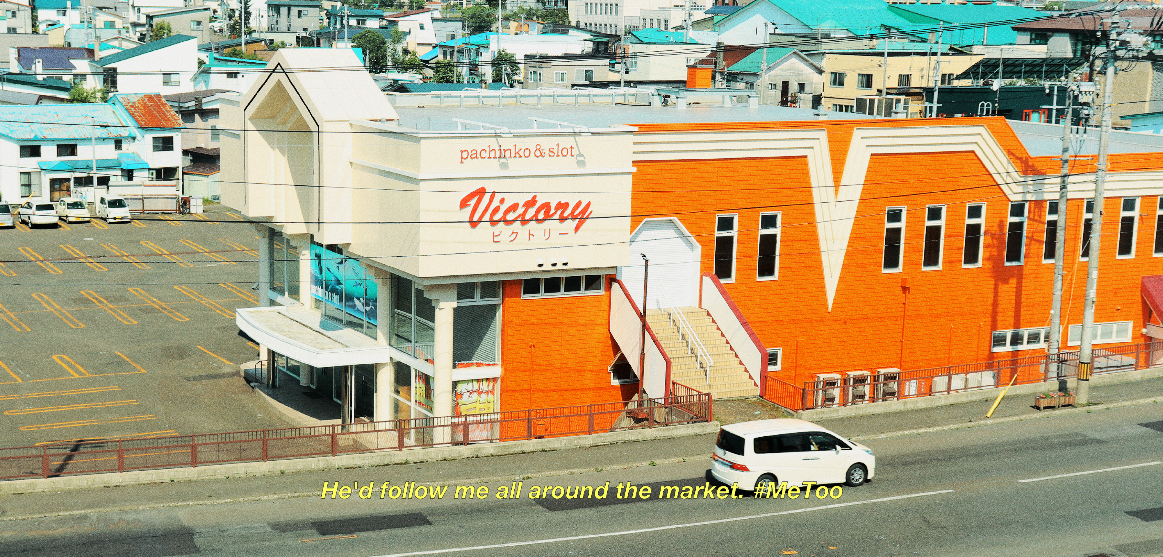
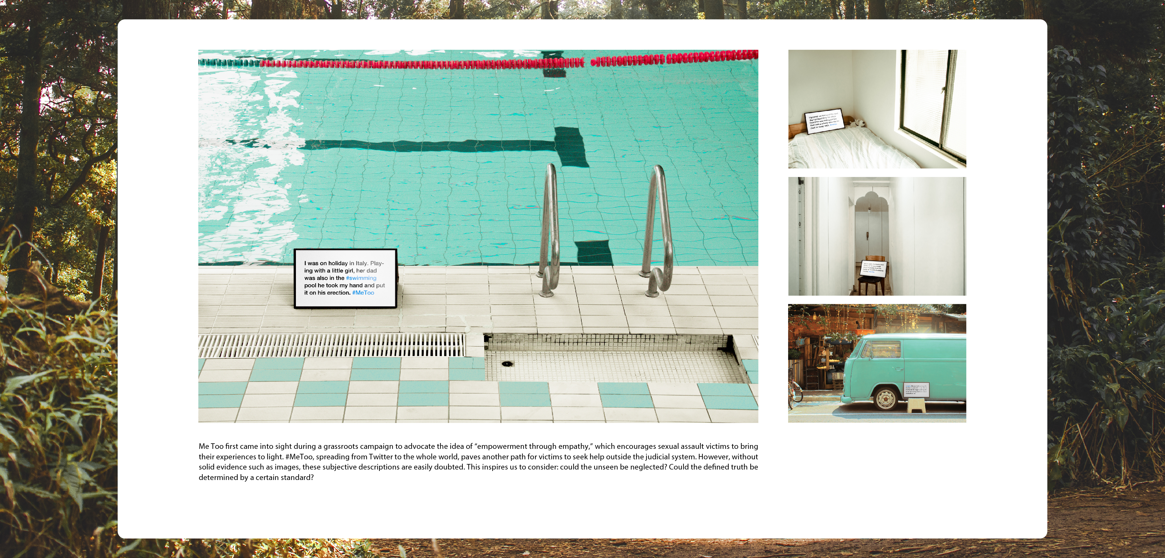
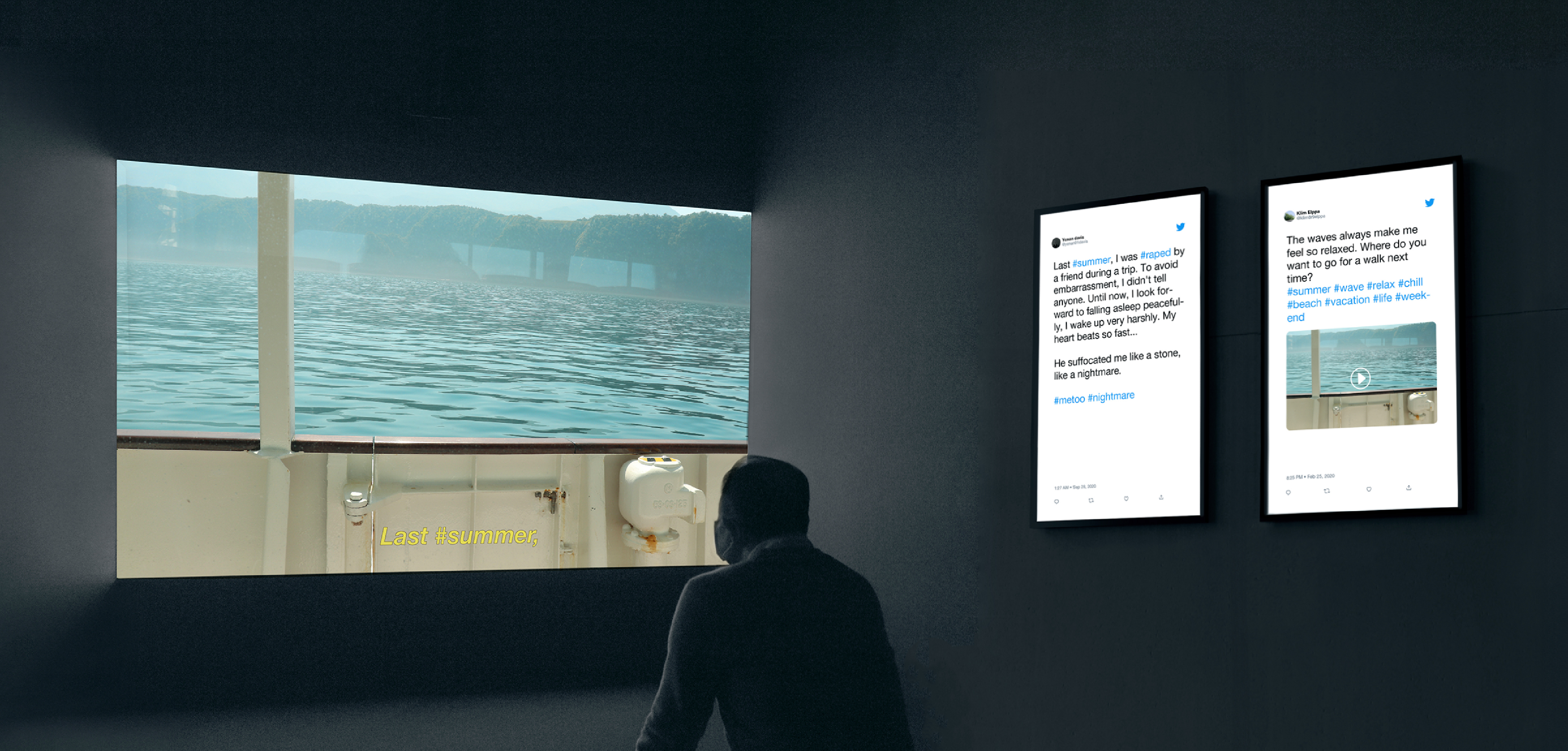
#DocumenTweets is a mockumentary about #MeToo. It connects reality and falsehood and further explores the gray area of the post-truth era, which breaks through the dichotomy between truth and lie.
◎ “If a tree falls in a forest and no one is around to hear it, does it make a sound?"
We picture a flock of "Twitter Birds" flying through the forest and witness the tree falling. The posts they send are collected as #DocumenTweets, a mockumentary standing in the gray area between truth and lie, and a new medium in the post-truth era.
Through getting actual posts and images from Twitter, the mockumentary encourages people to take a wild guess in the fake scenario made up of reliable information.Is a phenomenon necessarily true when it’s with a solid scientific basis? Does an incident stand for a certain truth once there are pictures as evidence? The answers become more blurry in this post-truth era.
Me Too first came into sight during a grassroots campaign to advocate the idea of “empowerment through empathy,” which encourages sexual assault victims to bring their experiences to light. #MeToo, spreading from Twitter to the whole world, paves another path for victims to seek help outside the judicial system. However, without solid evidence such as images, these subjective descriptions are easily doubted. This inspires us to consider: could the unseen be neglected? Could the defined truth be determined by a certain standard?
◎ Post-truth Era: The Blurry Lines between Truth and Falsity
The term “post-truth” was declared by Oxford Dictionaries as word of the year. In our time, the world is full of fake news for political use, and misinformation is widely spreading. The access to proof and the truth relies on authority, leading to the confusion of what to believe: the reality might stem from falsehood, the denied might be the reality. When the unavailable truth becomes insignificant, is it necessary to hold on to what is real?
◎ Falsity: The Result of Realities Combining with Each Other
In our mockumentary, we randomly fetch #MeToo posts on Twitter and convert the words into a narration. These, along with the images accessed from searched keywords, encourage people to take a wild guess in the fake scenario made up of reliable information. The accusation towards perpetrators, together with various images, trigger our imagination: Did the incident really happen when the picture was taken? Could these images serve as evidence?
The imagination is actually an illusion made by us, as make-believe obscurity. In fact, the victims couldn’t get images from the crime scene. Evident posts and images create fake connections, and people might suddenly find out that we, unexpectedly, are willing to believe the stories that stand between truth and untruth.
◎ Self-examination
Breaking through the established documentary of “recording the truth,” #DocumenTweets becomes a new medium in the gray area which delivers information that isn’t true nor false. The era of new media creates aspects transcending truth or falsity and uses real information to produce a non-existent documentary in cyberspace. Yet, it rouses people’s reactions in the real world.
In the era of new media, the information resources are more varied and, at the same time, more obscure. Is global warming occurring? Could scientific basis stand for absolute reality? Nowadays, a lot of issues are in the grey area between reality and lie. We focus on topics concerning female rights that we already paid attention to and then put the truth in this new vehicle to reconstruct. However, the mockumentary makes us easily believe in lies and doubt the truth.
#DocumenTweets exists in a complete post-truth world, in which everything is in the gray area of authenticity, and the truth could collapse easily. When the social standards no longer rely on reality, what difference would there be in the world’s rules? In this world, we no longer believe in the very truth, no longer stick to what is real, and everyone could subjectively interpret the truth. In a society where the same truth could evolve multiple certainties, will it be a harmonious sight or instead deteriorates the gap and opposition between people?
Designer. Chiayu Lee, Guo Chi Tang / Programmer. Wang Shan Ying, Tsai Min Yun / Instructor. Ho Chiao Wei (DML)
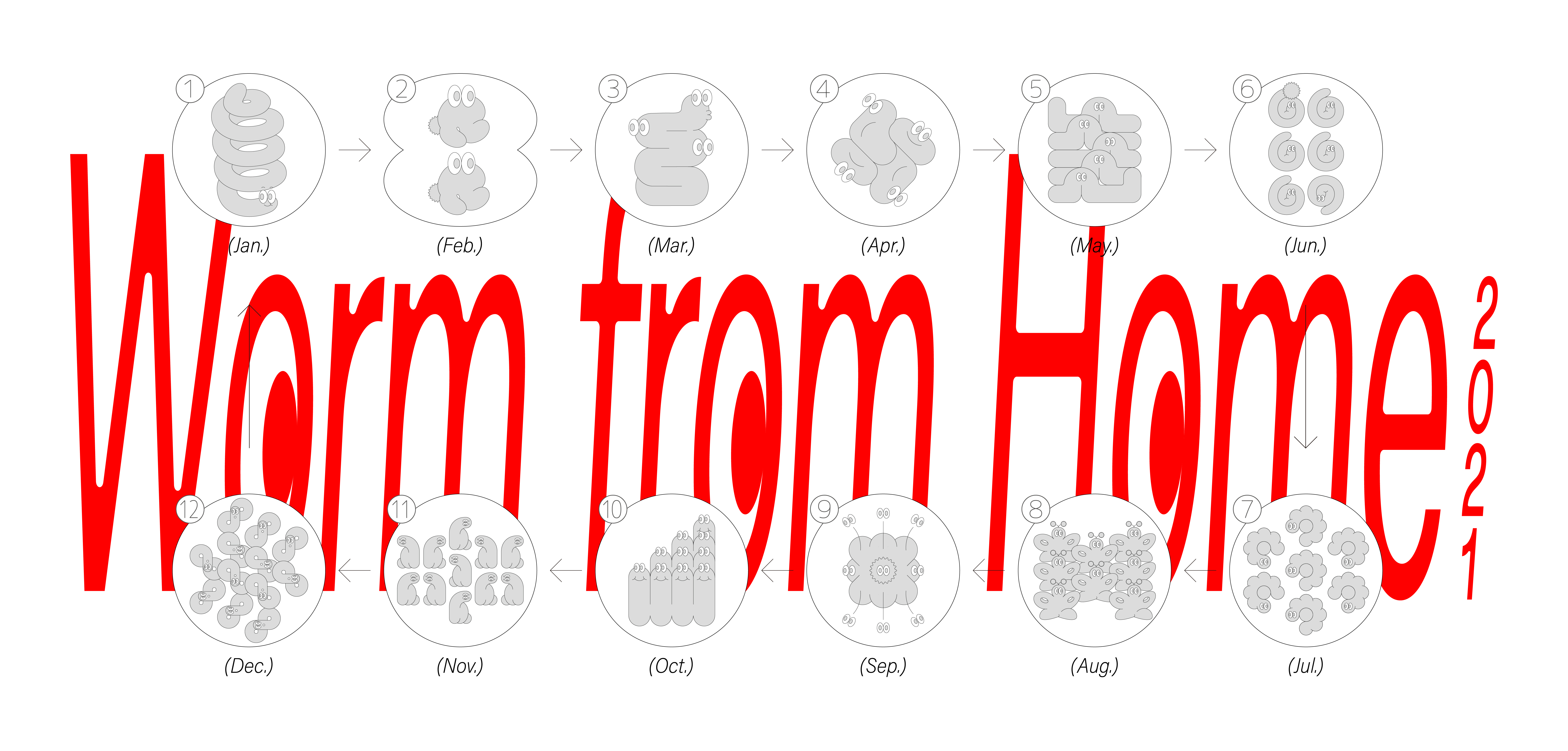
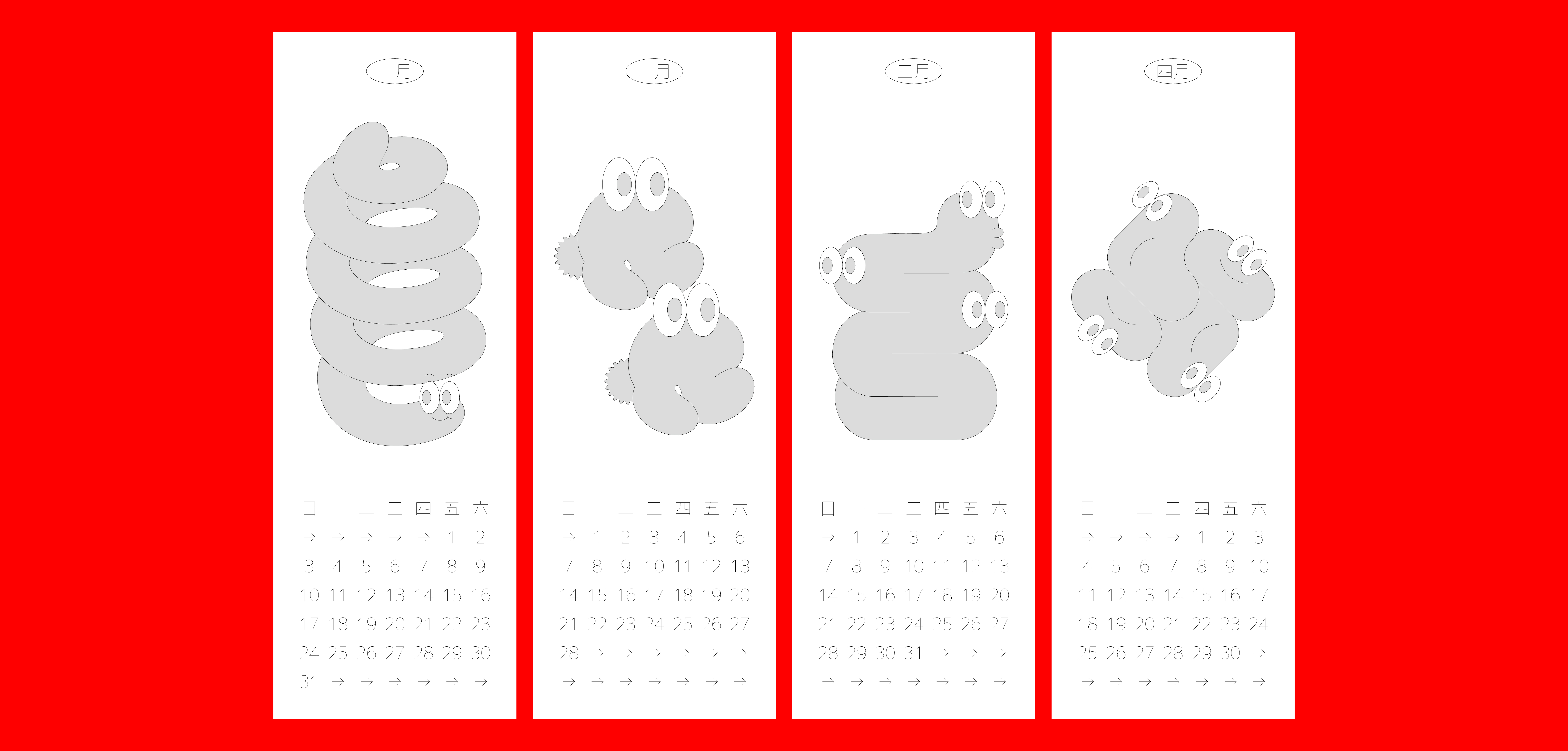
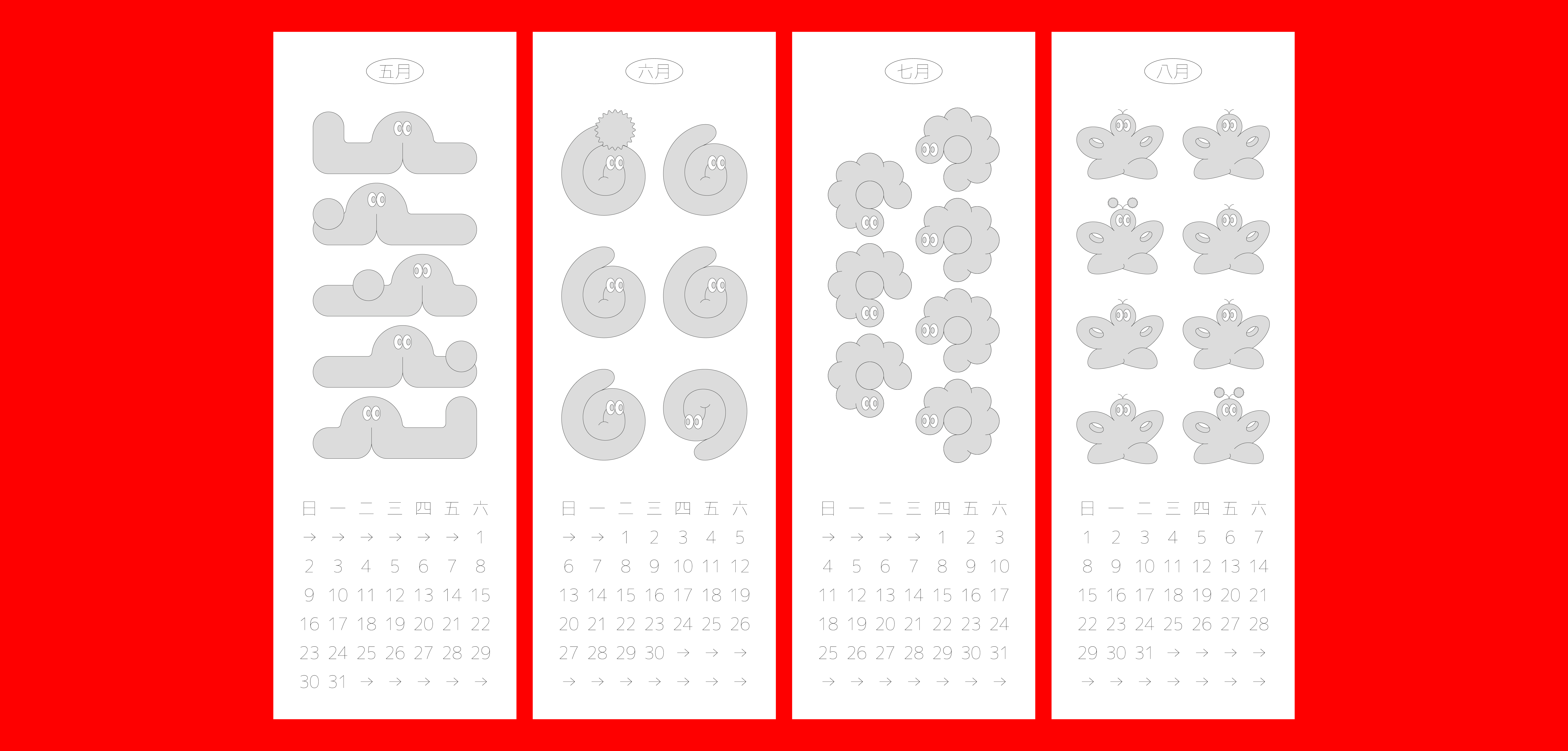
Worm from Home (2021)
A worm at home, a dragon abroad—this is the comment my mother gave me when she saw me basking in the sun on the sofa like a lump of mud. I used to get up and refute, but then I thought, “Why don’t I style my whole year with this ‘soft and rotten worm’ ?”It was how I began this project.
“Worm from home” is an intimate and inner project to record the ups and downs of my mood. In the process, I constantly tried to substitute the psychological changes of the past, and recall the days of peaceful coexistence with these twists and turns. As more worms are split every month, sometimes clear and sometimes chaotic, I also know the regular cycle of my mental clock better.
Designer. Chiayu Lee
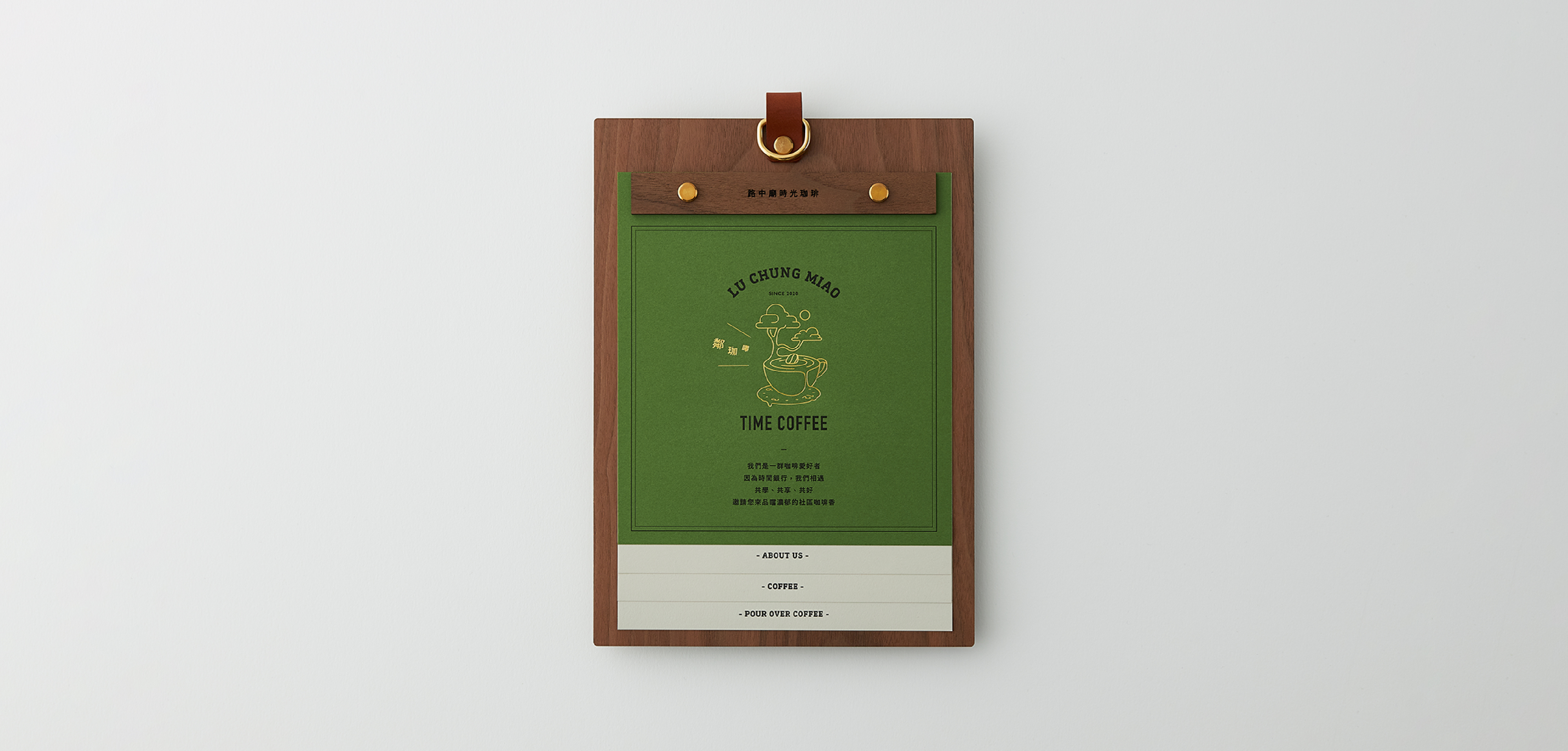
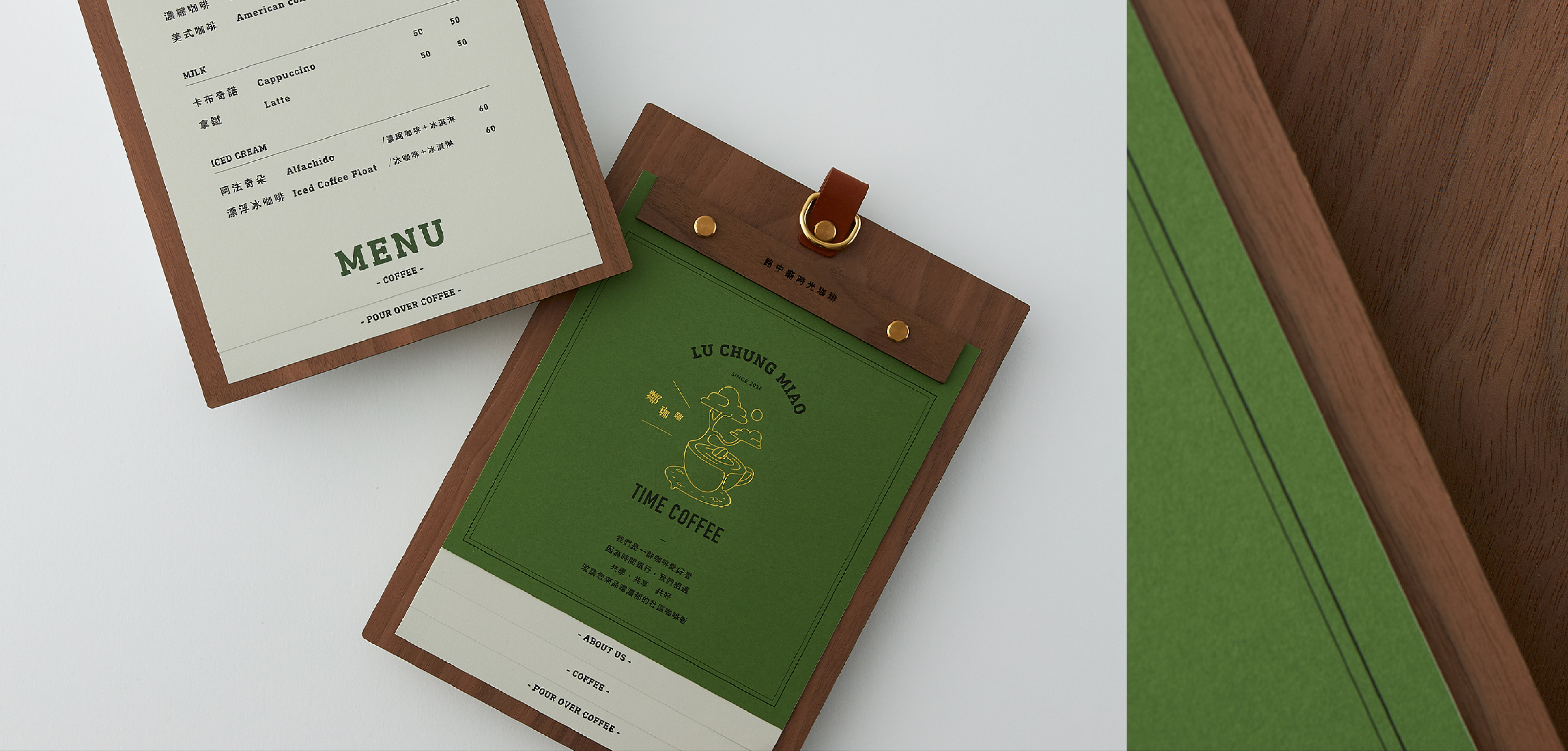
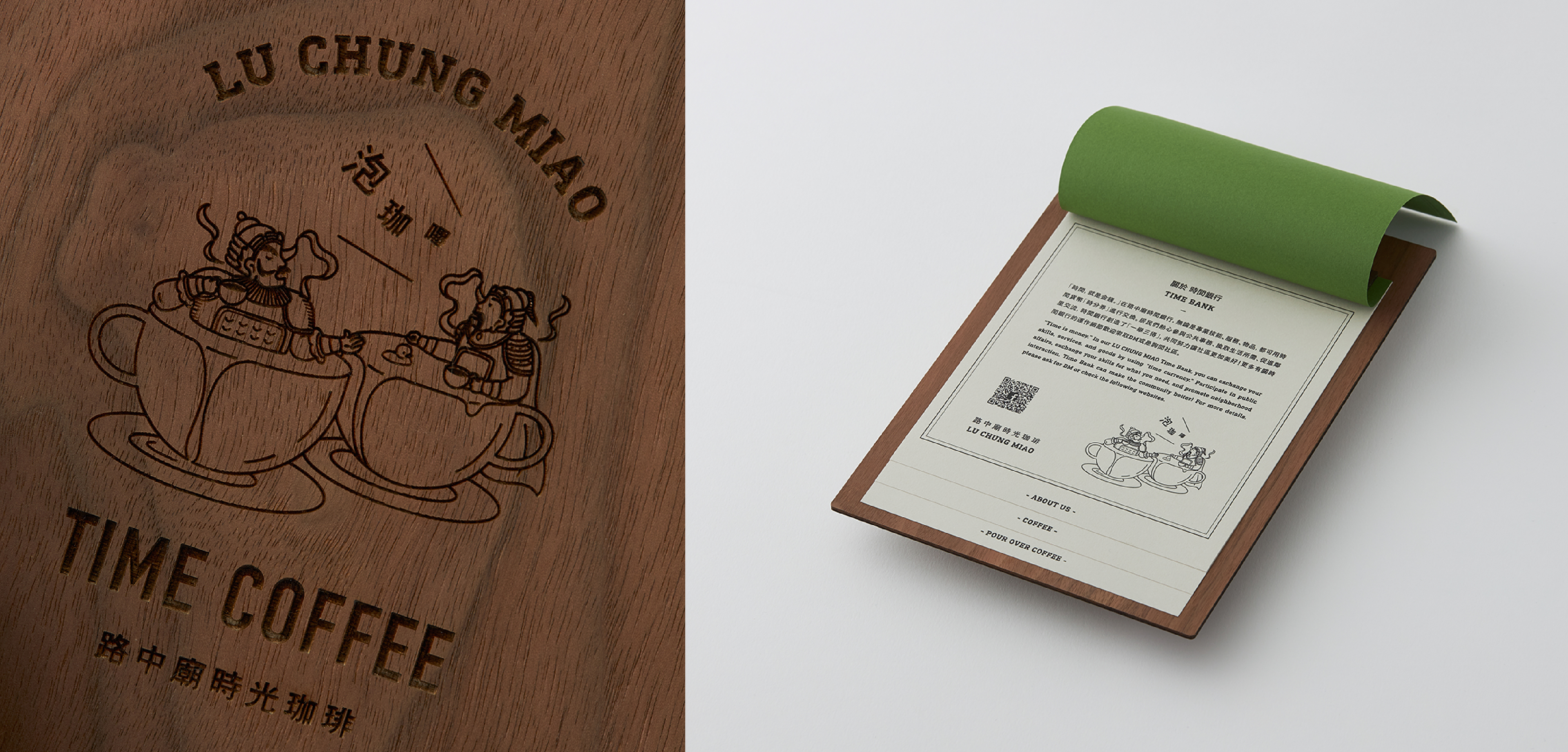
Lu Chung Miao Time Coffee (2020)
Lu Chung Miao Time Coffee is constructed by Sun Yat-Sen University and the elders of Lu Chung Miao community. The brand identity concept is based on the essence of the community coffee house, incorporating special colors such as old banyan trees, temples, time and currency into the design.
Emphasizing the compatibility with the region, whether it is brand image or color selection, we are committed to making Lu Chung Miao Time Coffee like the coffee house lacking in the community.
A coffee cup carries an old banyan tree. The overflowing coffee flows down becoming the bottom time of the cup. This is where we visualize the community's sympathy, and show the imagery of the identification sign, and it is also the beginning concept of Lu Chung Miao Time Coffee. The image of the temple door god soaking and chatting in the coffee acts as a visual extension of the echoes around. The latter creates an unfinished atmosphere, complements the former situation, and cleverly depicts the complete brand imagination.
The overall identity is specially presented in a fun composition to make the brand more local and to strengthen the sense of intimacy. The two shouts of “Lin Ga Beep” ( “Drink coffee” in Taiwanese ) and “Pao Ga Beep” ( “Make coffee” in Taiwanese ) make the menu sound like the logo and the extended vision. Narrative, it automatically reflects the picture of drinking coffee in the Lu Chung Miao community.
We extend a series of clear brand recognition systems with identification signs. The process of the menu uses dark green with wood panels to symbolize the old banyan tree, adding leather, thunder engraving and metal buttons and other media to create a warm and friendly relationship with the community, Trying to subtly influence the brand atmosphere with every small detail.
Client. Institute of Public Affairs Management,NSYSU / Producer. INPIN DESIGN / Creative Director. Wang Chia Ying / Art Director. Lin Chieh Hui / Designer. Lin Chieh Hui, Wang Chia Ying, Chiayu Lee
/ Copywriter. Wang Jia Juan
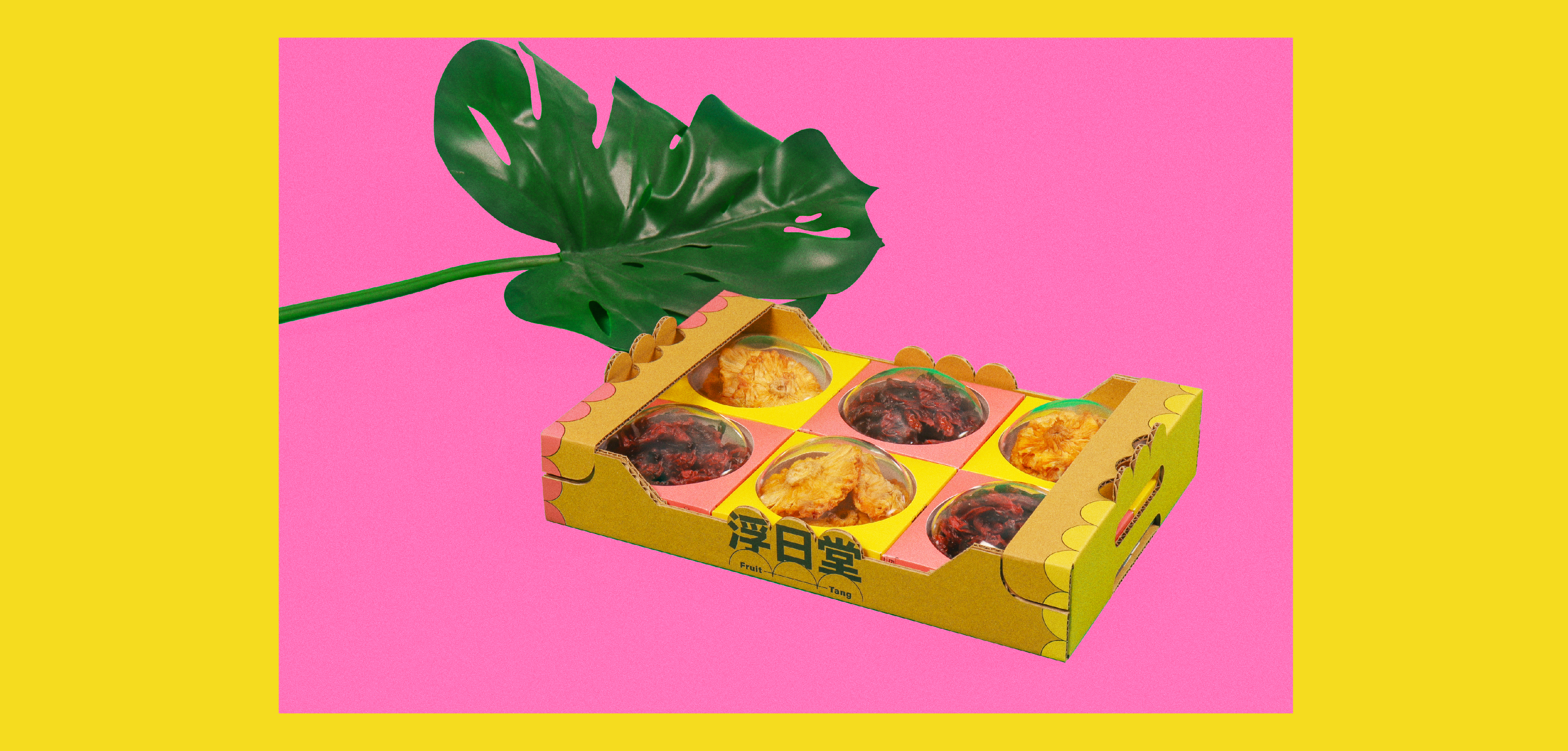
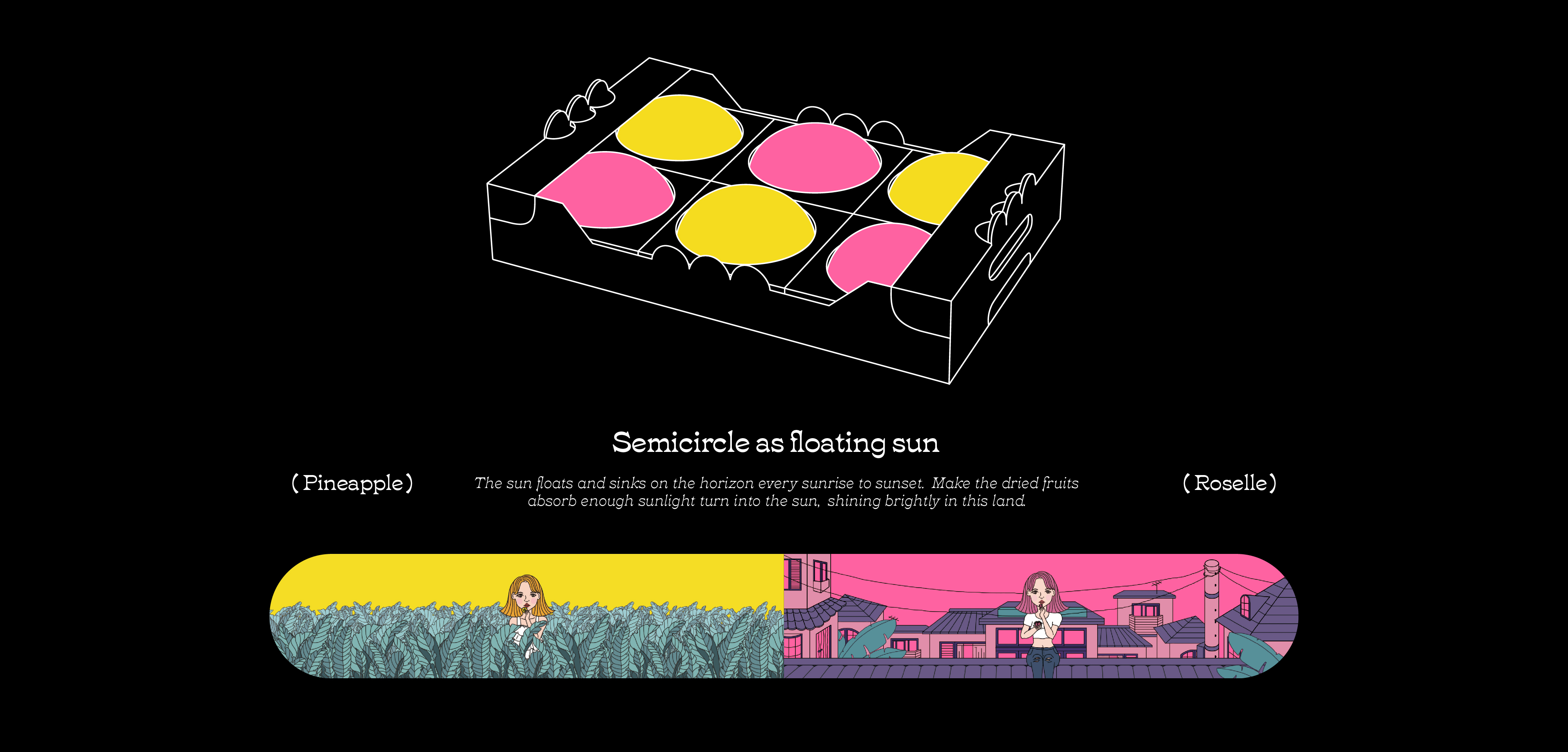
Fruit Tang Packaging (2020)
Non-commercial use
Semicircle as floating sun: The sun floats and sinks on the horizon every sunrise to sunset, making the dried fruits absorb enough sunlight turn into the sun, shining brightly in this land.
The semi-circular inner packaging represents the scorching sun floating on the ground level. After opening, it is placed upside down on the bottom square box. The two different scenes in the illustration suggest the convenience of being edible anytime, anywhere. The design of the outer packaging is based on the traditional fruit corrugated box that gives a fresh impression, emphasizing that the quality of the loaded dried fruit is as fresh as that of the direct-delivery fruit, and the use of UV printing technology in the production makes it more lively and energetic.
Designer. Chiayu Lee
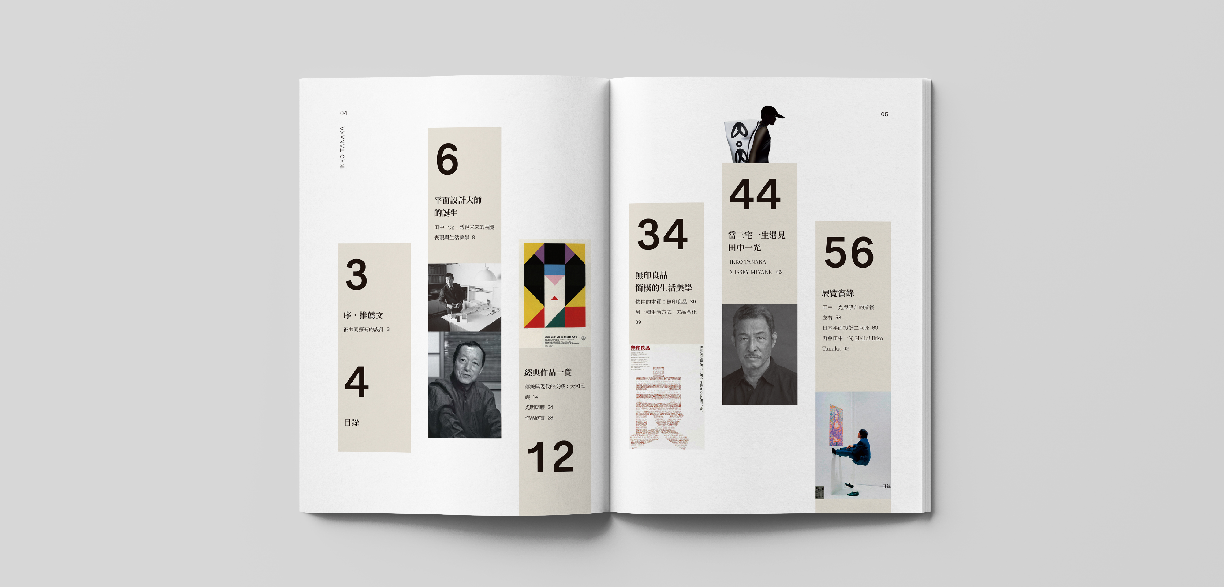
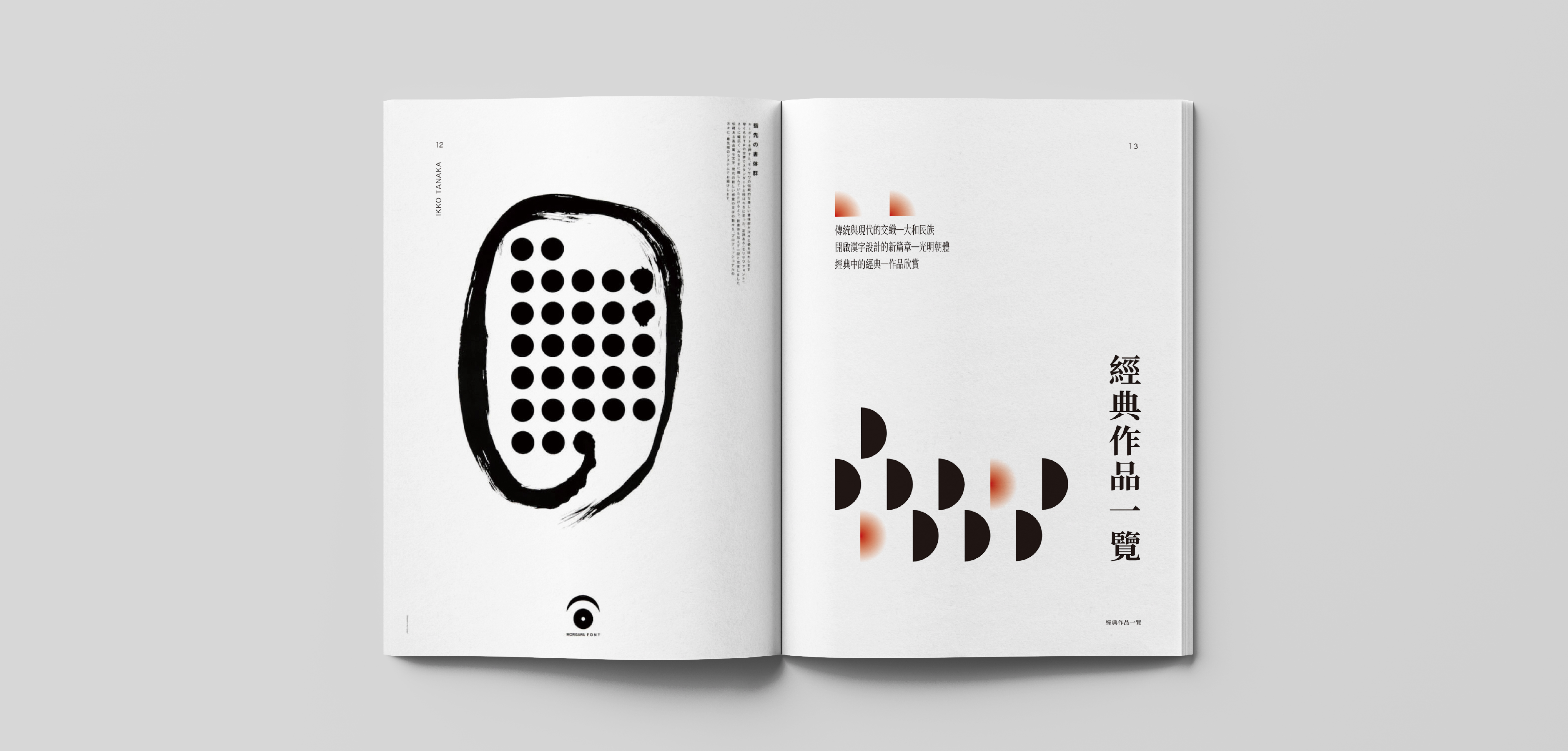
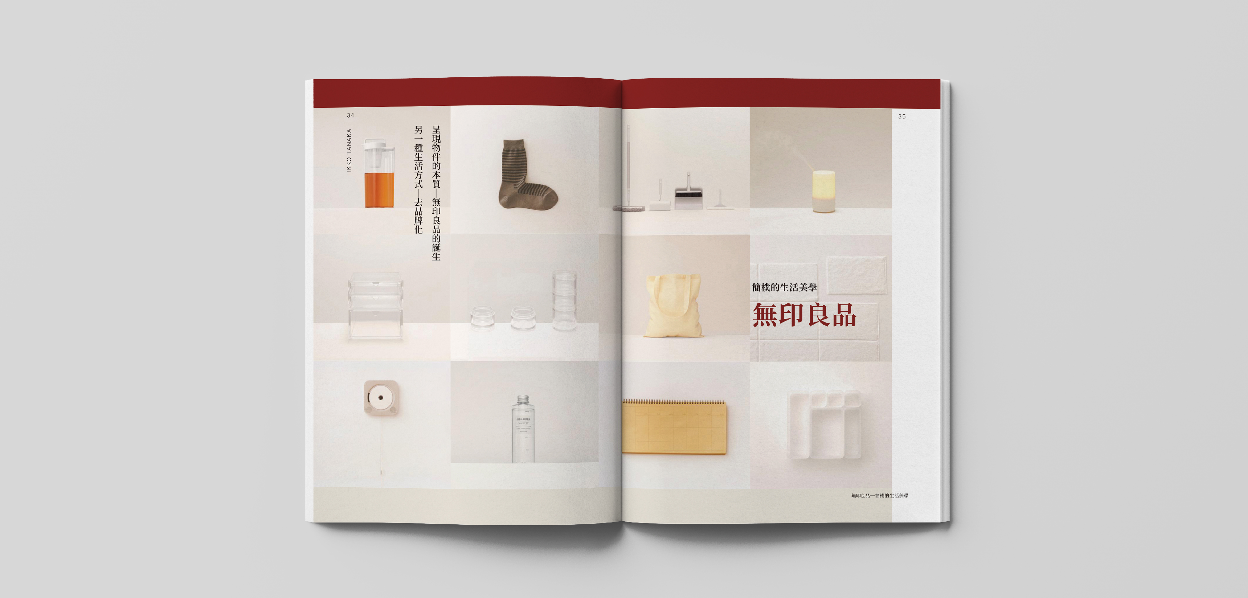
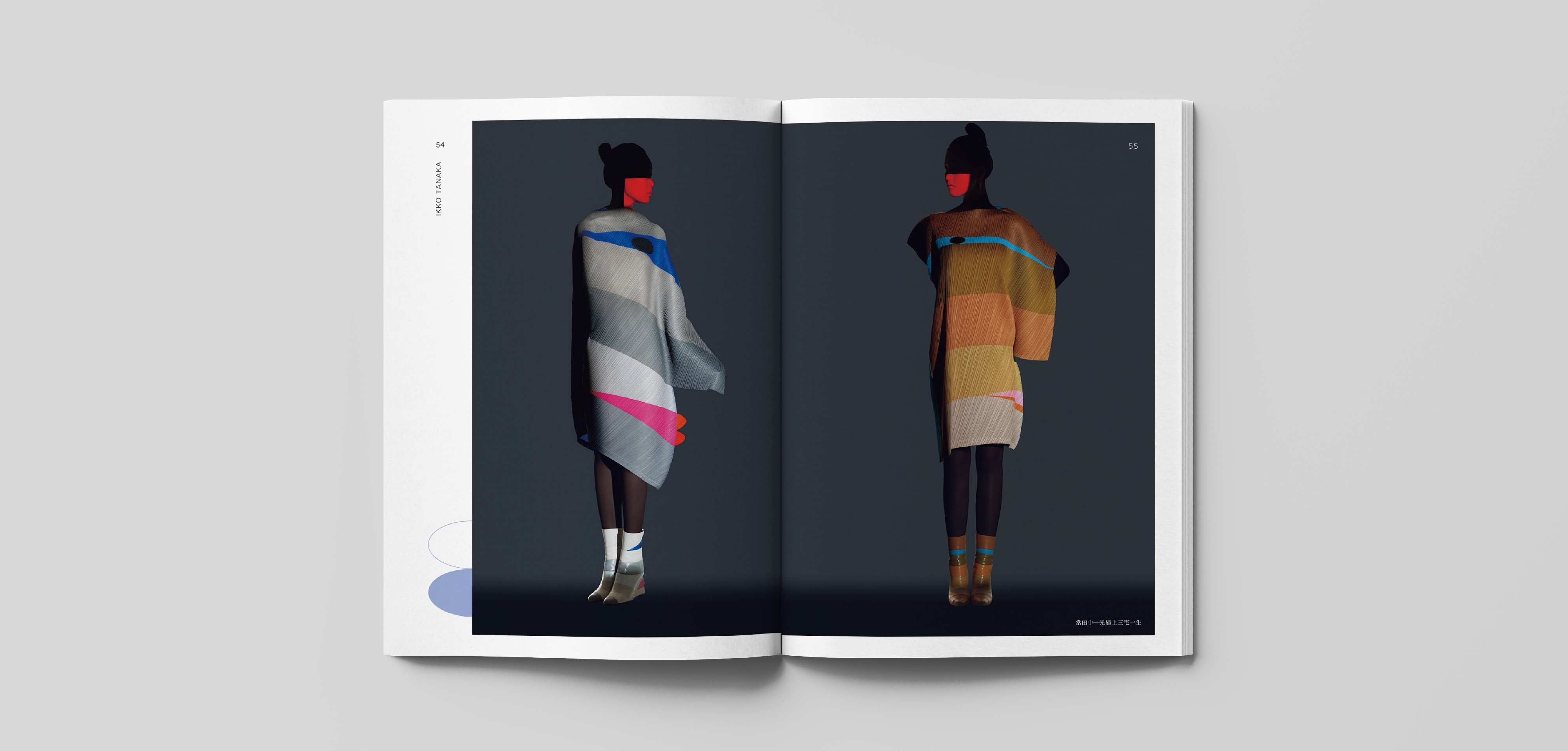
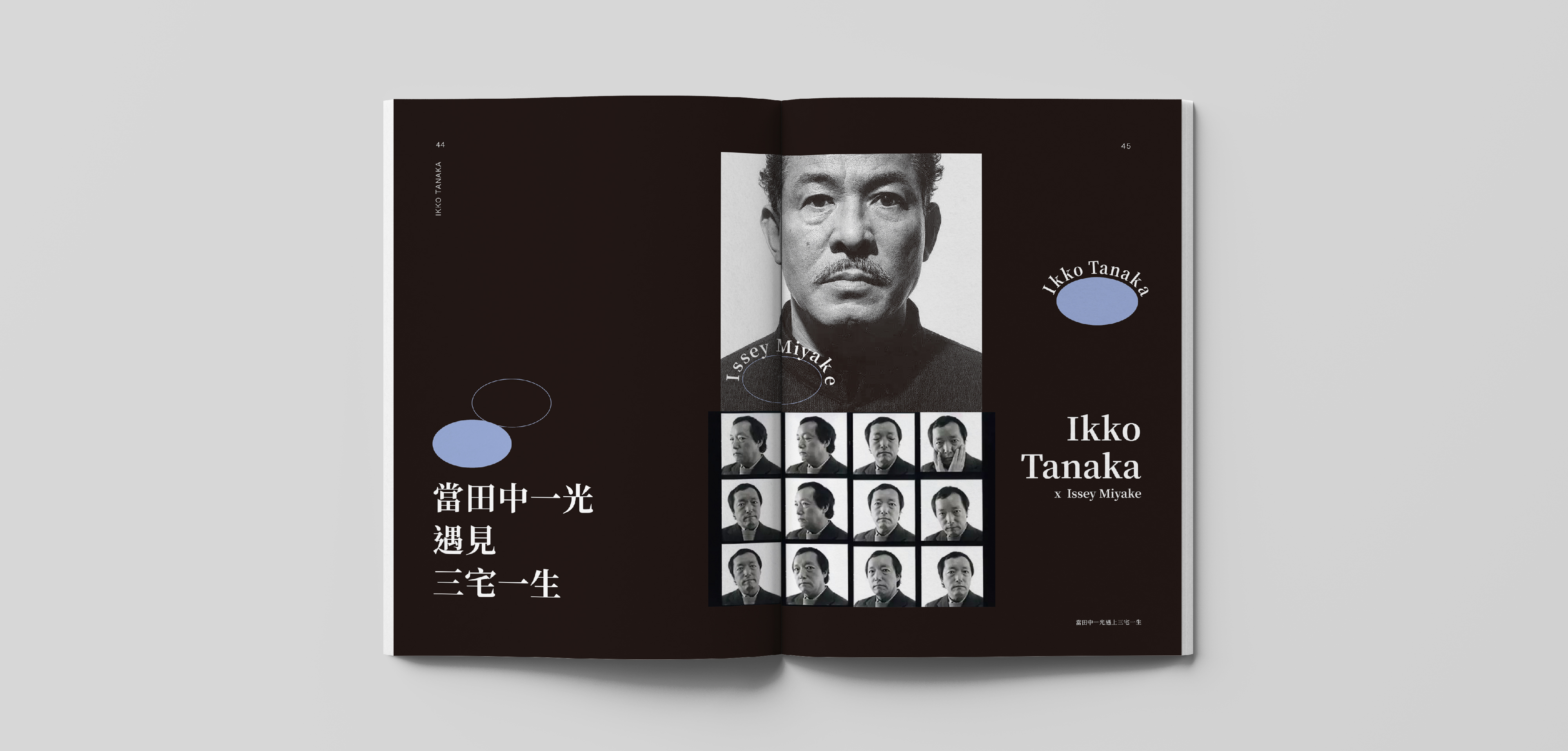
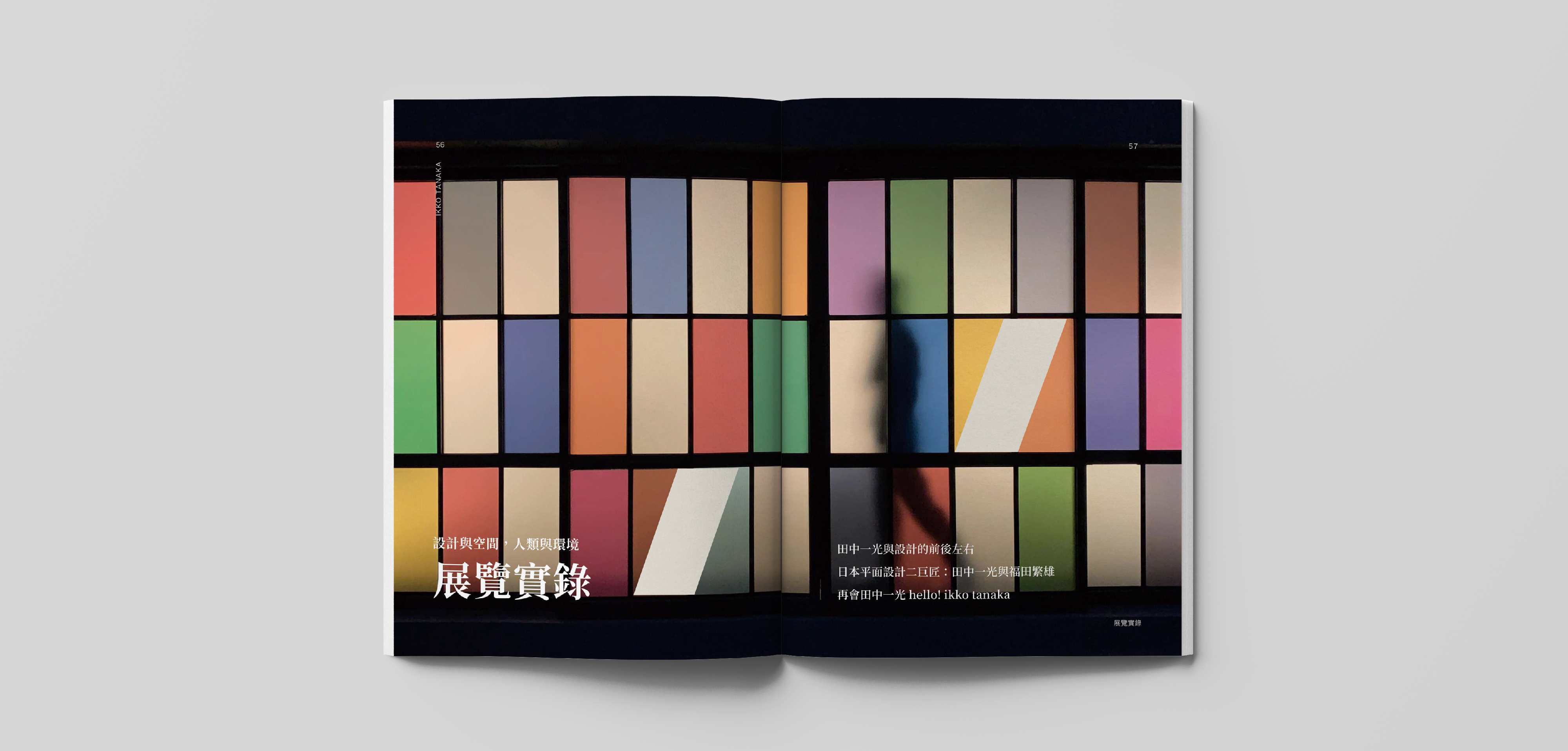
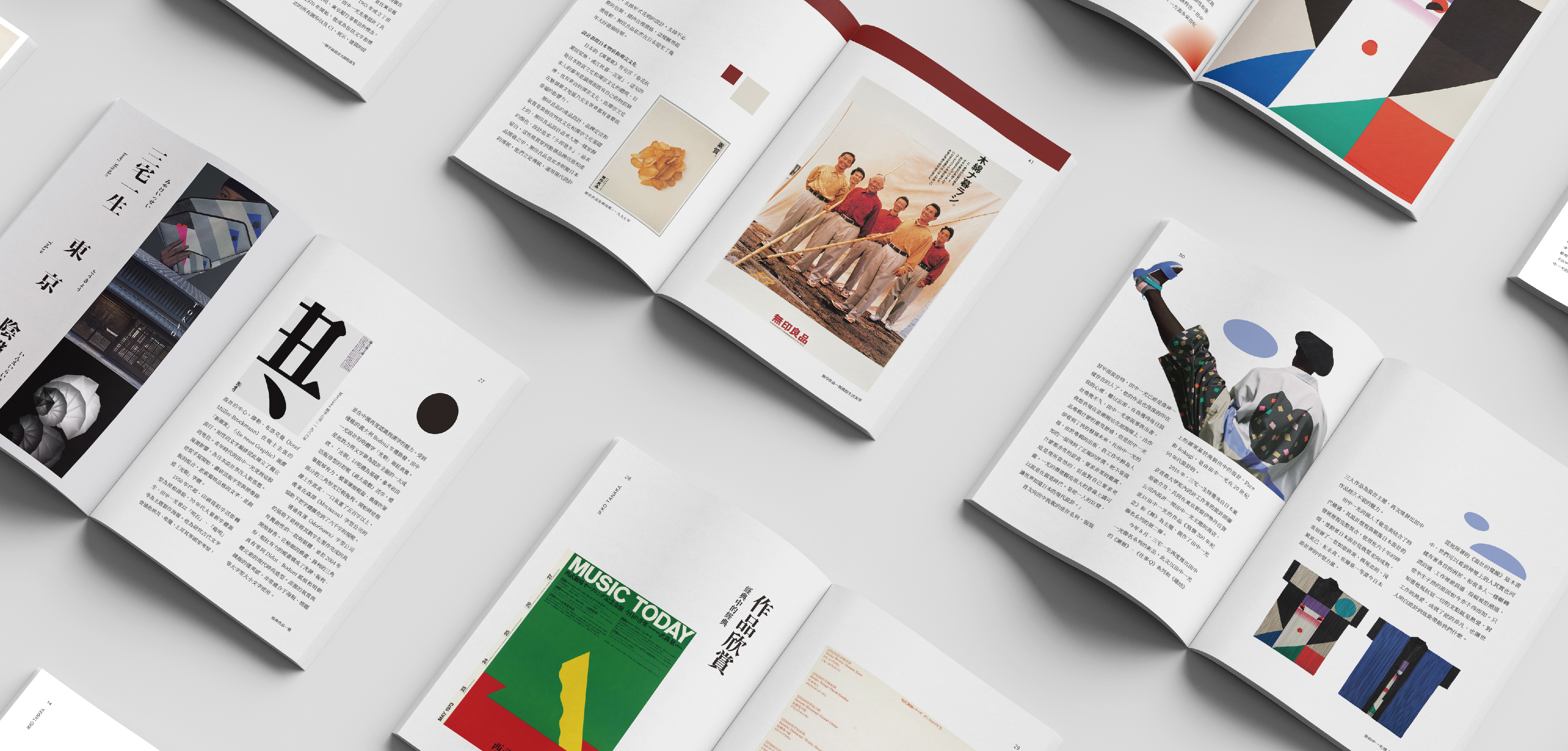
Ikko Tanaka (2020)
Non-commercial use
Ikko Tanaka blends modern design concepts into Japanese traditional art, and his works have obvious individuality and a certain expressionism. He has unique ideas and techniques in integrating traditional eastern and western aesthetic concepts with the characteristics of eastern and western cultures. With his unique form of expression and visual language, he has set off a movement of re-creation of the traditional spirit in the Japanese design world.
"Ikko Tanaka Reviews" includes many influential classic works, and records in detail how Ikko Tanaka used design to reflect the post-war reconstruction of Japanese society, and how MUJI, born under the anti-brand ideology, established the Japanese simple aesthetics. This book also introduces a series of fashions launched by Issey Miyake to pay tribute to his friends, and also includes detailed exhibition records of the three recent retrospective exhibitions of Ikko Tanaka.
In the cover design, the expression in Ikko Tanaka's classic work "Japanese Dance" was captured, and the simple circle and semi-circle were transformed and given new meanings. From a distance, it looked like a red sun rising slowly over the mountains, which happened to echo Ikko Tanaka, as the forerunner of the traditional into the modern, kicked off the prelude of Japanese contemporary design. The design of the inner page makes extensive use of the iconic elements of Ikko Tanaka, continuous geometric figures, filled with text and images, making the overall layout “more Ikko Tanaka”.
Designer. Chiayu Lee
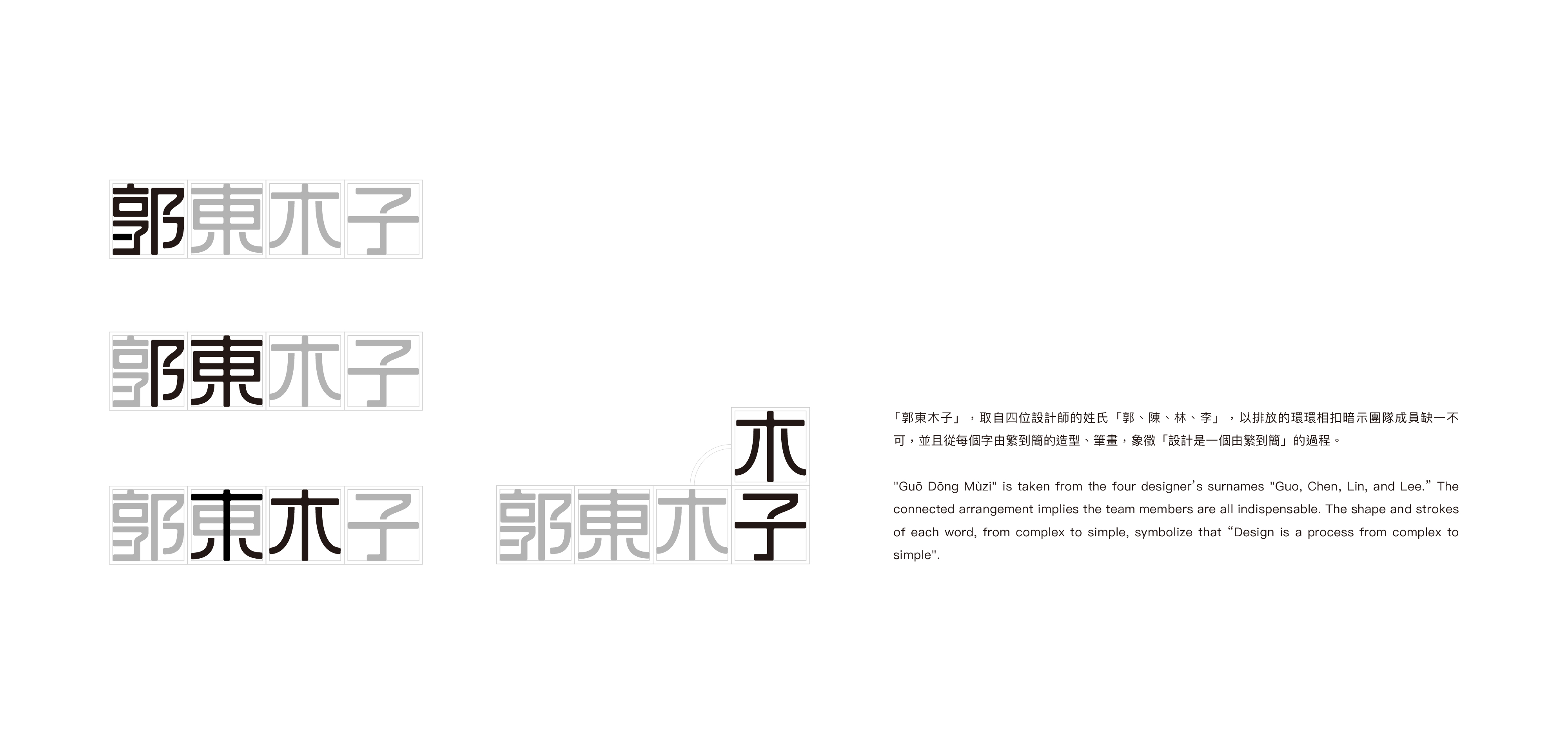
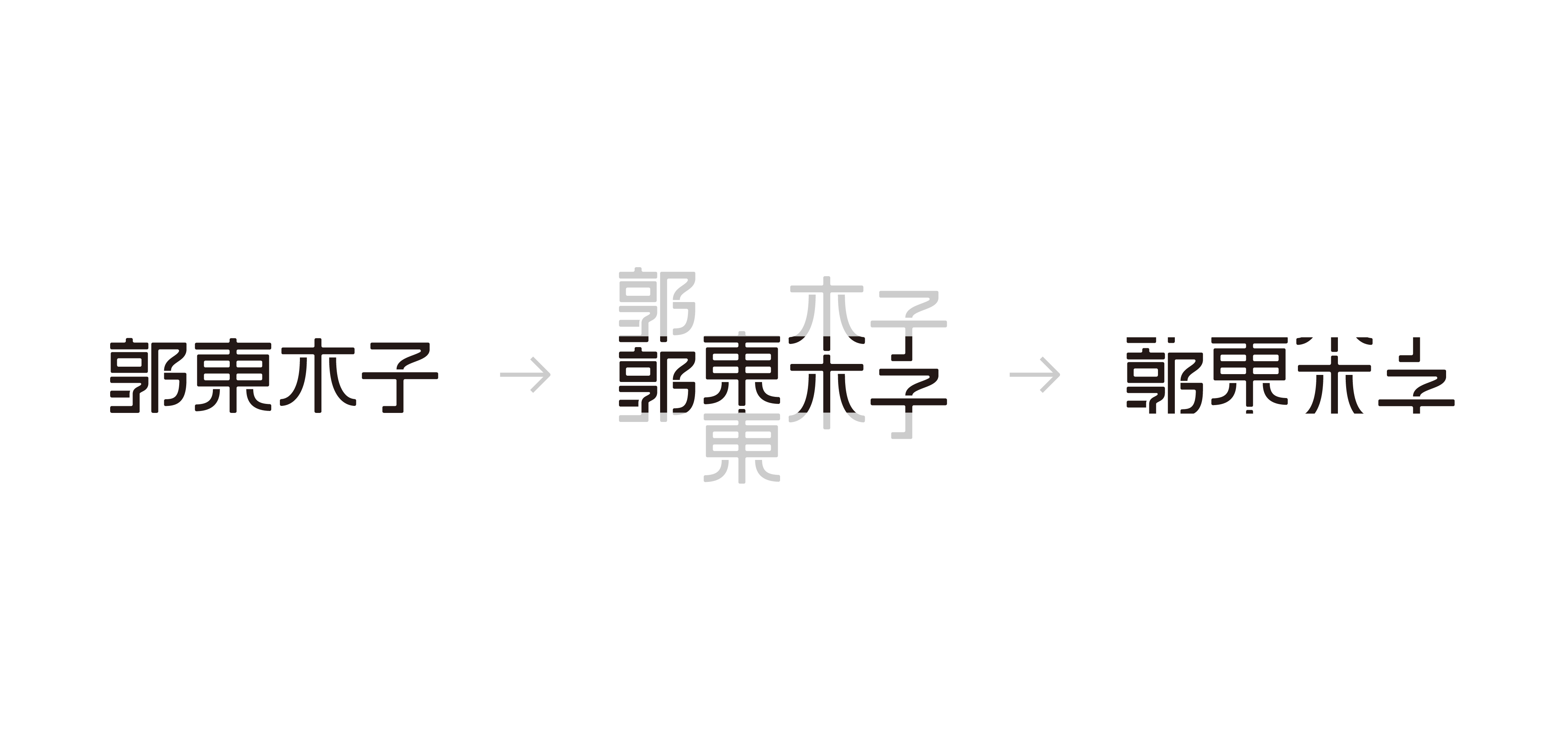
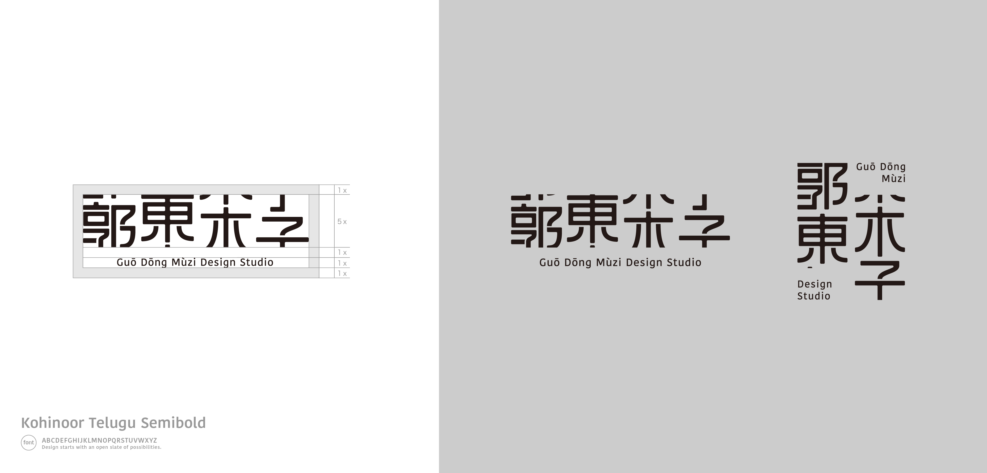
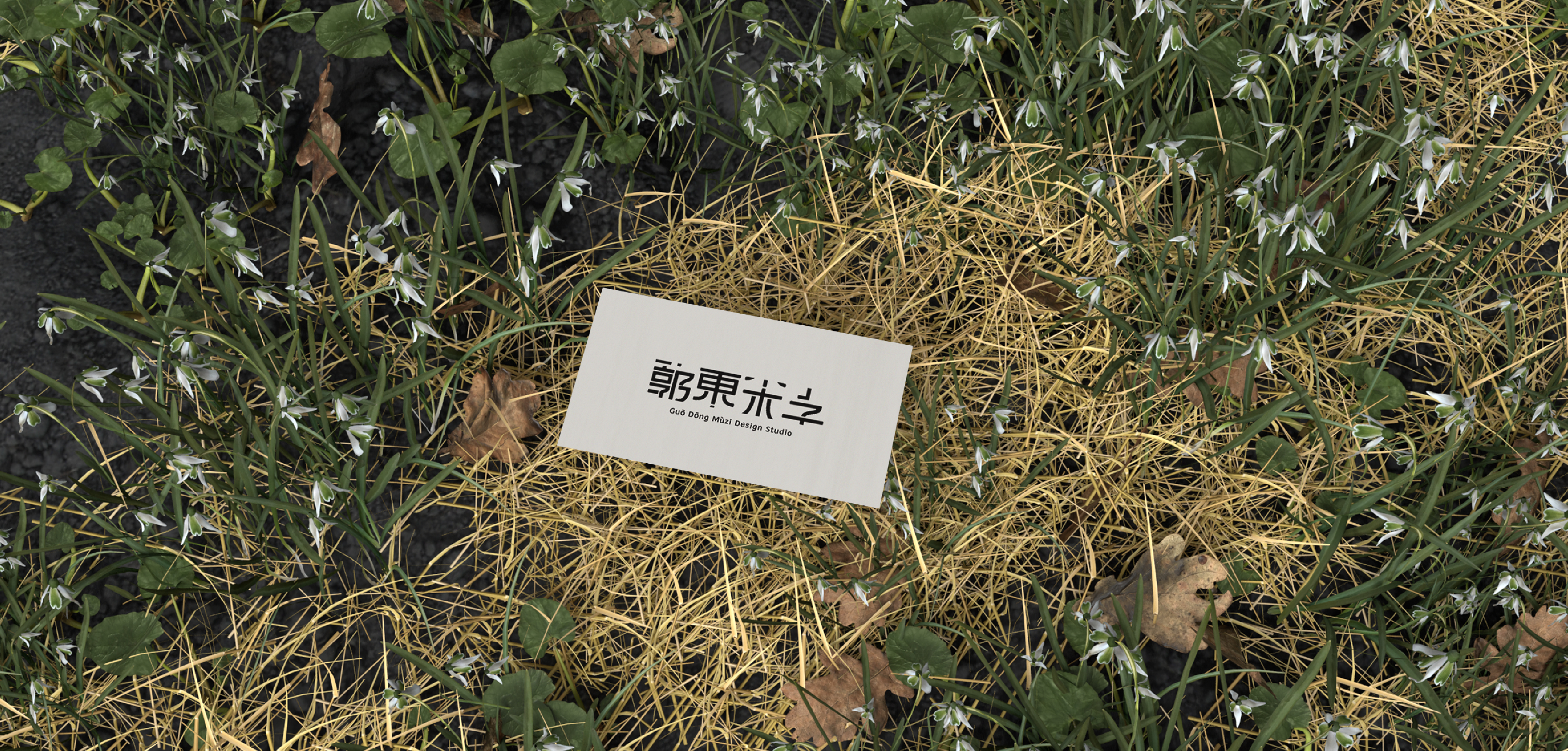
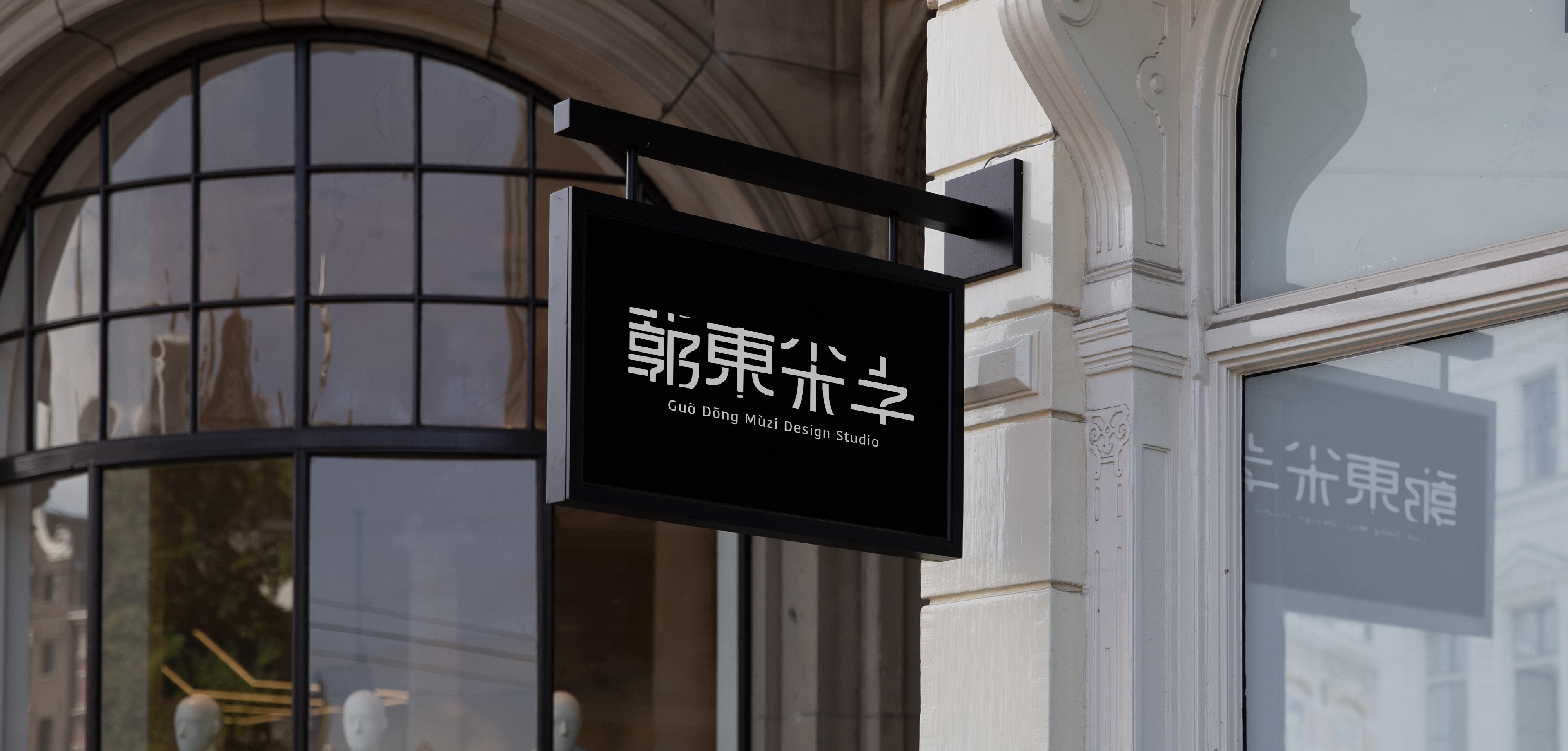
Guō Dōng Mùzi Design Studio (2019)
Non-commercial use
Guō Dōng Mùzi is taken from the four designer’s surnames "Guo, Chen, Lin, and Lee.” The connected arrangement implies the team members are all indispensable. The shape and strokes of each word, from complex to simple, symbolize that “Design is a process from complex to simple".
Designer. Chiayu Lee
![]()
![]()
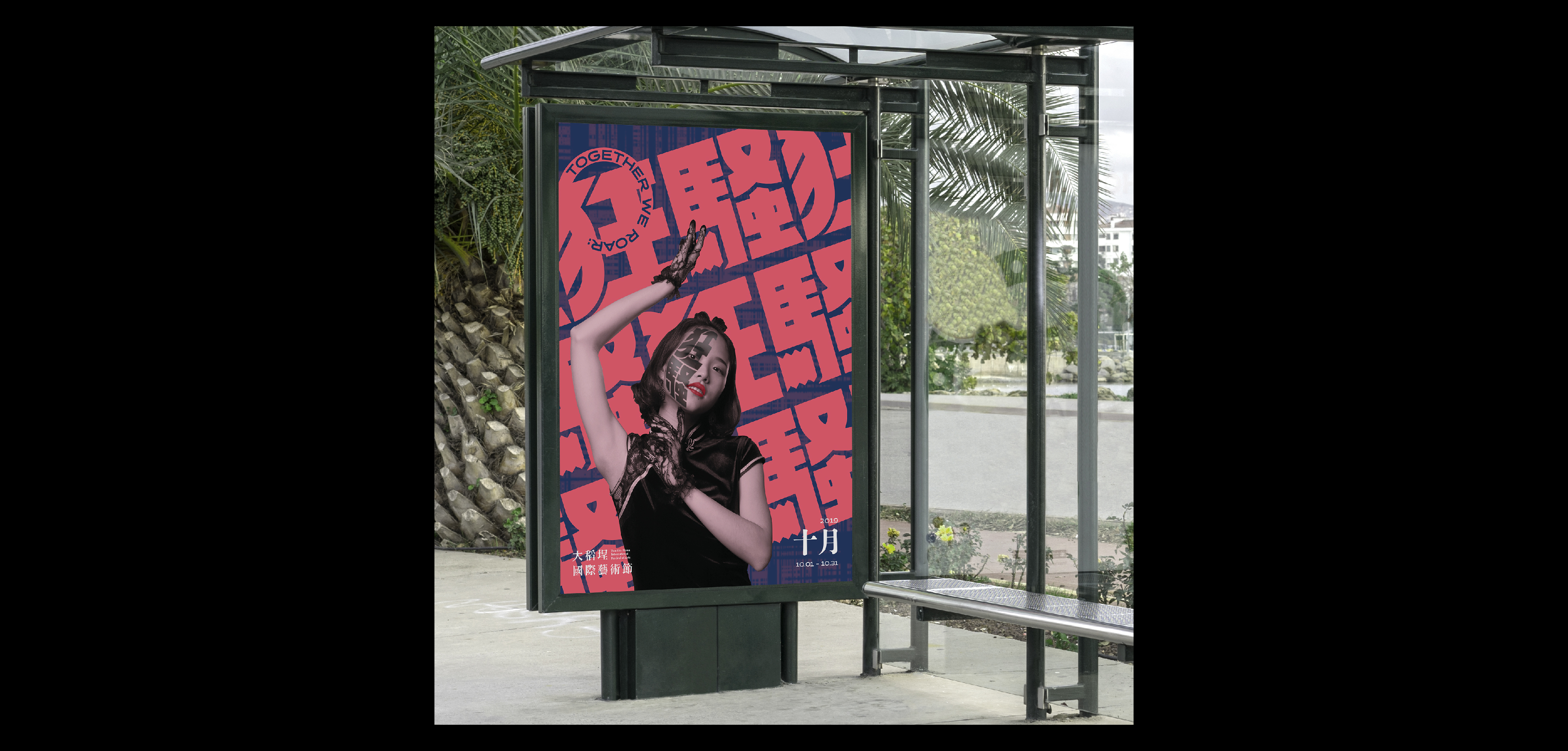
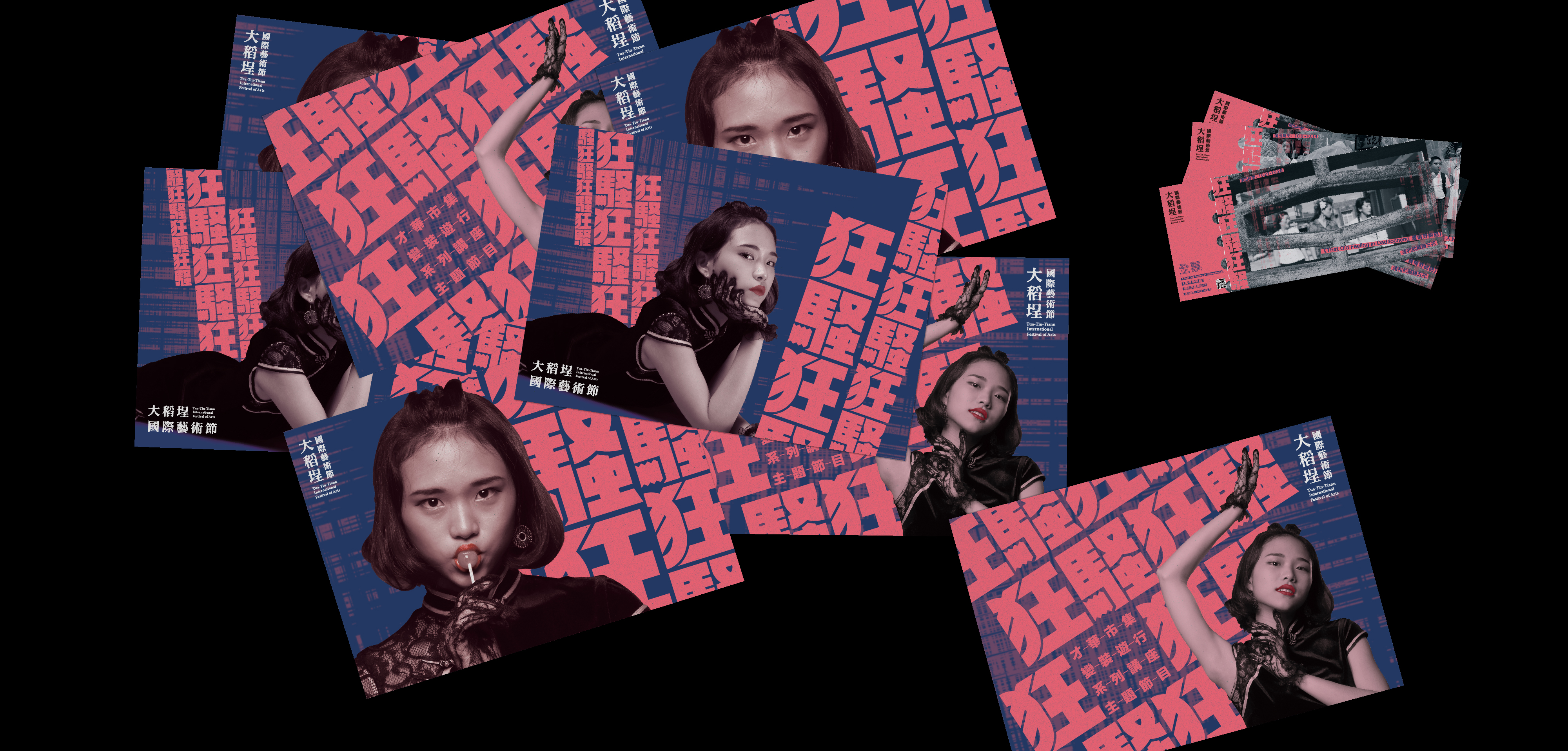
TTTIFA ”Together We ROAR” (2019)
Non-commercial use
TTTIFA (Tua-Tiu-Tiann International Festival of Arts) is held every October in the Tua-Tiu-Tiann district of Taipei by a joint venture of entrepreneurs and organizations from the area.
The mission of TTTIFA is to hold innovative arts performances that embrace interdisciplinary work and cross-cultural cooperation. In doing so, TTTIFA aims to nurture a platform for Taiwanese and international artists to work together.
TTTIFA's main theme is the spirit of “Kyousou Twenties,” the Japanese translation of the “Roaring Twenties," the phrase coined in the West to describe flourishing economic times and cultural innovations, embodied in the Art Deco movement and emergence of jazz music during the 1920s. "Kyousou" literally means "madness" and "disturbance," but we like to interpret this word as "creativity." As the spirit of the "Roaring Twenties" tapped into a reactionary energy to challenge traditional norms and spark social change, we look forward to what will emerge during the 2020s.
Designer. Chiayu Lee
![]()
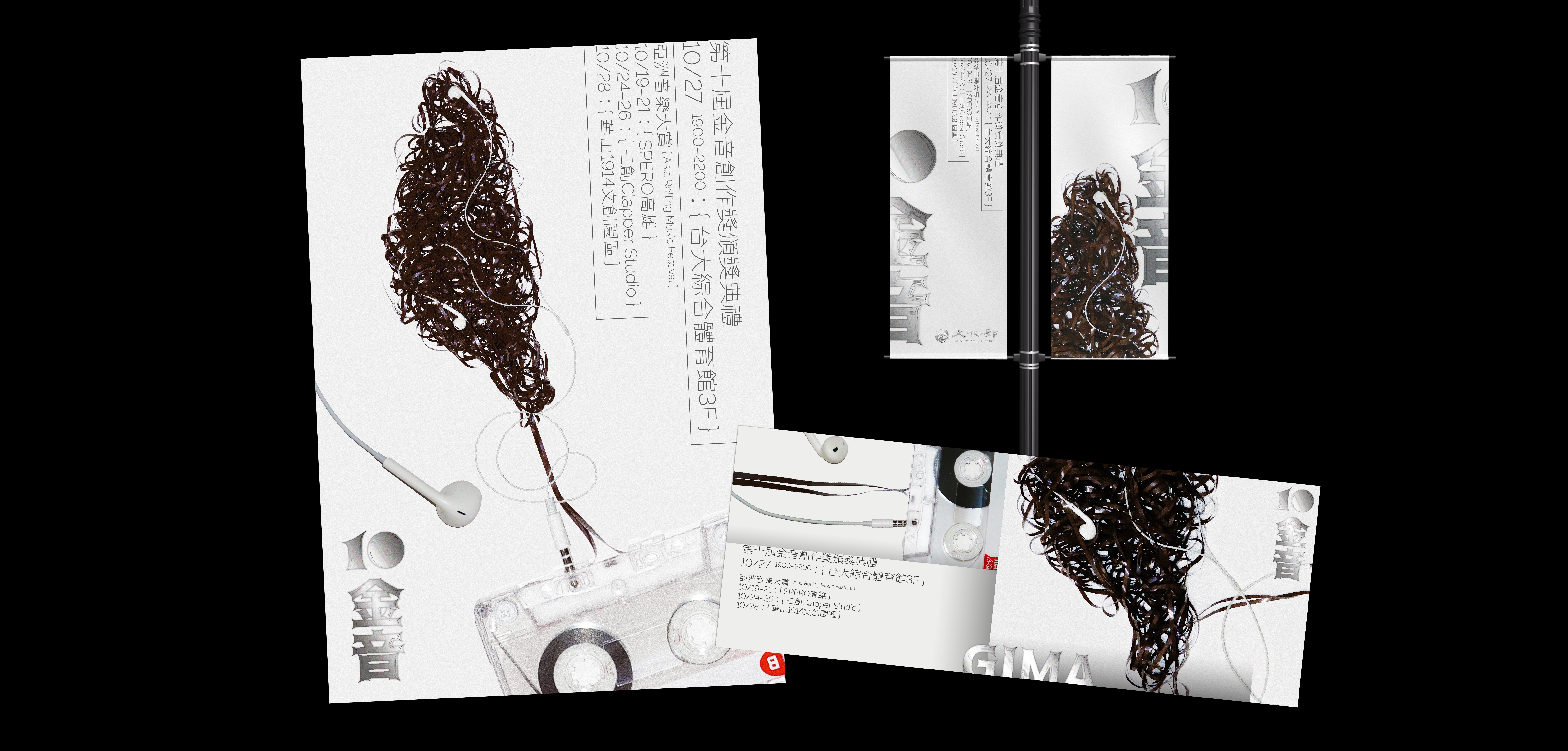
GIMA 10th (2018)
Non-commercial use
As a creation-oriented music award, the "Golden Indie Music Awards" aim to empower Taiwanese musicians to create as diverse music genres as possible. The Awards have three major features, namely Taiwan-first, creation-first, and categorization by music styles without language restriction. Since their inception in 2010, the Awards have bred various types of music creators in Taiwan and have become an important international music brand representing the freedom, diversity and originality of Taiwanese musicians.
The visual identity includes two types of music elements, cassette tapes and headphones, symbolizing creativities from history and culture, thereby giving birth to local original music. 2019 Golden Music Awards inherits the diversified development of Taiwanese music in the past, and further promotes it outward. It is expected to use Taiwan as a pioneer to build an international Asian music brand and become an "international musical award".
Designer. Chiayu Lee